3.24.2016

Boost Your Blog // What is a Style Guide?

If you've been reading blogs for a while now you're probably pretty familiar with the look of a certain blog.  You might even be able to pick out one of their Instagram posts in a sea of square pictures of coffee.  Or even do a double take when you see a familiar font in the wild.  But more importantly you may have recognized how cohesive a blog looks from post to post.  It could be the style of the images, the formatting of the text, etc.  The elements that create the consistent look of a certain blog is the essence of a style guide.
image courtesy of @rekitanicoledesigns

Successful blogs all deliberately implement style guides to create a specific look and feel to their blog.   A style guide can be really intensive, but if you're just getting started there are a few things you can do to give a cohesive look to you online presence with out digging too deep and overwhelming you.

So what does a style guide consist of?  Here are a few elements:

Fonts & Colors
A successful blog has defined fonts and colors used across all posts and pages.  Most notably you'll notice the text color and the color of the links and other design elements of the blog coordinate.  You'll also notice the limited number of fonts used for all the text on the blog.  Stick to about 2-3 fonts.  One for the body of your posts and any big chunks of text - about pages, about section in your side bar, actual text in your posts, etc.  One to compliment that text - the title of your blog posts, any headers in your side bar, top links, etc.  And one as an accent - maybe this is in the blog name at the top of the page, or an accent used on photos, maybe it is a part of your watermark on images, etc.  Limiting your fonts creates a pleasing and calm look to your blog.  Here is post on how to pair fonts and the different feel you'll get from each pairing.  The more you have going on the more chaotic it looks.  Stick to a color palette of 3-5 colors.  Choose a color for the main text, for the links, for your blog title, and any other design accents.  This also adds a cohesive look to your blog.  My favorite place to find color palette inspiration is ColourLovers.com.  I love that website for creating my own palettes.  One of my favorite posts on the blog is how to make a color palette inspired by your Pinterest boards!  Find that here.

Image Style
Another way to add a cohesive look to your blog is to choose your image style.  What images will you use for you blog?  Will you use your own photographs?  If so, how will you incorporate stock photos if you feel like you need to?  A lot of blogs have a signature style when it comes to their photos.  I can't say that I've identified mine yet as I really like to experiment with photography.  But I can say I've decided on how I make my beauty shot images.  The beauty shot is the image that opens up the post and sums it all up.  It is the finished product we'll be making or the pinable image that engages those on Pinterest.  A beauty shot is a great way to create an image to encourage pinners - it should tell your whole story in one shot.  Here is a post on tips for creating Pinterest friendly images.  I've also recently shared tips for flat lay photos.  These tips work great for your Instagram feed as well.

For my blog images, I use the app Phonto to overlay a translucent gray box and use the font Furtura Medium to add the text.  I also use the app A Color Story to brighten my photos and give them a professional look.  I say professional because I am such an amateur it's crazy!  Just goes to prove you don't have to have super crazy equipment to make a great image.

Blog Tags & Categories
Another important part of creating a cohesive environment is how you categorize your posts.  This is a tough one - another one I have to admit I haven't pinned down.  Start of by covering the main themes you have on your blog.  You may want to refer to you blog calendar or recurring posts to create your main blog categories (here's a really old post on how I create my editorial calendar - I still use this method!).  Then decide on your sub categories.  There might be a few to a post but there shouldn't be 20.  Most of my posts have a bout 5-7 tags that categorize the posts on my blog.  If you scroll to the bottom of a post on my blog (on some blogs the categories are at the top) you'll find links under a section called Labels.  If you click any of those links you'll be taken to all the posts that fall in that label.  When creating tags/categories/labels for your posts you want to be as inclusive as possible and remember to use your tags.  You don't want to lose a post somewhere and it not be included in your DIY tag.

Tags like this will also make it easier for you to link all the past posts on a certain topic.  For example - here are all my PicMonkey posts, all my Boost Your Blog articles, all my random posts about my Life, all the posts on planners.  But if you click on one of those posts from one of those categories you'll often find that a PicMonkey post also has the label Make it Monday which will take you to all the DIY posts on the blog.  The Boost Your Blog articles may also have the label of Planner Printable.  And so on and so forth.  You want to create an easy way for your readers and yourself to find all posts in one category.

These are three things you can start doing now to get your blog easier to navigate, easier to look at, and give a better overall experience to your reader.  If you've clicked through some of my old posts in the body of this post....you'll see I haven't consistently followed my own advice!  To me blogging is all about experimenting.  You'll eventually develop a style and keep with it!  I've had this blog design for a long time now and I used to change all the time!

Do you have a consistent style for your blog?  Any tips on developing a style guide?

xoxo, Moe

3.22.2016

Why I Don't Mind the Instagram Algorithm Change

In case you didn't know.....Instagram is initiating a change to the way you see your feed. No longer will you open the app and see posts in chronological order.  You'll now see posts that are catered to your viewing habits, or catered to what Instagram has extrapolated what your viewing habits are.  This has caused a huge uproar, there was a petition and even a boycott......but I'm here to tell you that I don't really mind the algorithm change, and here is why:

Instagram is a business
Instagram is not just some free app for the masses to use and lap up....it is a business.  There are more and more ads running and more and more businesses (both big and small) are using Instagram to advertise.  I've heard the term 'strong armed' thrown around about how this algorithm is forcing small businesses to have to pay for exposure on Instagram.  This was in comparison to how your page on Facebook will get little exposure if you don't pay for it.  As far as I know, the problem with that was the page wasn't as engaging as someone's family feed, or a group.  A group is way more engaging because that is the main goal of a group.  (ps. I'll never create a group on Facebook, too much work!)   I don't know how far this will go, but Instagram will do what it needs to in order to bring in that cash money.  Instagram knows how you interact with what makes it the most money....so it will move confidently in that direction. 

It will force us to be more engaging
The way your photos will be seen, from my understanding, is the interaction a user has with your feed influences your feed's presence on their timeline (I'm using timeline for lack of a better word).  So this will force you as an Instagram user - whether for business or pleasure - to take better pictures, use better hashtags, offer better content than a picture of your coffee and the heart eyes emoji.  You'll need to use your feed to engage with users.  You'll have to step up your Instgarm game and use it as a source to provide quality content, just just as a social media outlet to promote your other endeavors.  I'm excited - to me it's like micro-blogging, and I totally just made that up.  I've already started to offer supplemental content to my main outlets (blog/etsy/youtube) as well as unique content created just for my feed.

Technology is always evolving
Remember when we petitioned Facebook to remove is from our statuses?  And that was like the best thing ever!  Remember when people wrote notes on Facebook and now it's like what is that even for?  Remember when Twitter didn't have that little header image?  Remember when YouTube used to change where the info bar was?  I totally remember people saying info in the side bar way back in the mid 2000's.  Guess what, times change.  And we'll continue to live long after the algorithm changes.   And if it sucks, someone will invent something way better and we'll all move over to that platform.  Remember when we all left MySpace for Facebook?  There are people, with Facebook profiles that have never, ever had (or maybe even heard of) MySpace.  So yeah, things change man.

I used to think that after Facebook there would be nothing else.  But now I find myself being super social on Instagram.  And now I think that Instagram is the end all to the social platforms.  But in a few years we'll all be flocking to the newest craze.  I just hope it's not Periscope...because I really don't get Periscope.  

If you're feeling jazzy, why not follow me on Instagram?  I'm @fivesixteenths.  I'm not going to ask you to turn on post notifications though, because no one wants their phone going off a zillion times a minute with all the accounts they follow.

How do you feel about the change?  Do you care?

xoxo, Moe

3.17.2016

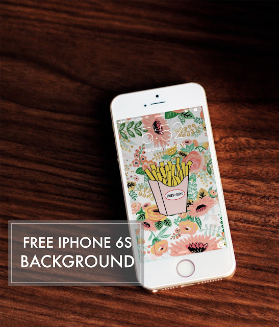
Free iPhone Background // Fries > Guys

The other day while playing around in one of my favorite overlay apps on my phone I created a hilarious phone background for myself that I wanted to share with you today.  If you haven't downloaded it, Rhonna Designs (+ all the other associated apps) is a great app to play with!  There are tons of inspiring overlays for free and even cooler ones for purchase.
I'm going to be bold here and say this - when I first downloaded this app I was turned off by the number of religiously oriented overlays there were.  For someone who is super religious I think this is a great app to reaffirm your faith and share your faith with others.  But for someone who isn't religious I was sad that some of the beautifully design text overlays I was drawn too had a religious tone.

The design and offerings of this app are amazing - florals, beautiful fonts, tips for pairing fonts, great doodles and overlays, wonderful controls for text, and new sizes including those that would be perfect for creating planner dashboards!  Additionally there are quite a few overlay packs available for purchase that have some great sayings.

That is precisely what I found when I went to play around in the app again.  I love the fun packs Pretty & Punny.  There are cute little hand drawn graphics that rock!

So....long story short, I was able to create this positive little background for my phone.  The fries > guys saying means to me take care of yourself, do the things you love, be the person you are before worrying about others, especially dudes.  I hope this little background inspires you.  You can find the lock screen here and the home screen here.  Simply download and set them as your wallpapers on your device.  This is designed for an iPhone 6s so you may have to scale the image to fit your specific device.

xoxo, Moe

3.15.2016

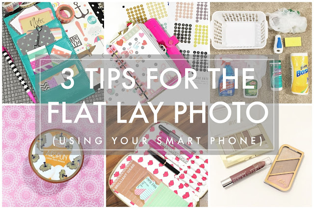
Trend Tuesday // Beautiful Flay Lay Photos using the iPhone

Have you ever heard of a flat lay photo?  You may not know the name but you do know the style - a beautifully styled bird's eye view of something super trendy.  You can find the flat lay all over Instagram from makeup, to music, to cleaning supplies (that last one is me!) and creates a beautiful all encompassing image to tell a whole story.
My favorite flat lay to shoot is of beauty products but anything you can lay on a flat surface works great to tell a story like this.  Here are a few tips for flat lay photos

Background
Decide whether your photo will benefit from a simple background or a background with texture.  This may seem a little bit weird but it will give the over all feel to your photo and help you tell the story.  Adding a patterned paper in a contrasting color will give a pop to the scene your photographing.  Photographing against a white background will add a bit of simplicity to the scene. Play around with different backgrounds to see what story you can tell.  An example in the collage above is the flat lay of cleaning supplies - I chose to photograph against my carpet because cleaning is a part of my home, this is an everyday occurrence in an everyday scene.

Lighting
The lighting in your photos is pretty important.  Often you can get a little bit of brightness through apps but if you brighten too much you'll end up losing quality.  If you don't have a light box or nice light to illuminate the scene pretty evenly see if you can get the light to scatter across the scene from a window.  Stage your photos outside or when the lighting is perfect in a certain room.  It may take a couple hundred practice shots in a few different lighting situations to find exactly what you might be looking for when photographing certain scenes.  I usually take photos of beauty products on my white makeup storage because believe it or not the lighting in my closet is pretty nice!  I also use two clamp lights with bright daylight bulbs to take other blog photos.

Apps
When it comes to apps and filters I think the best thing you can do is create a natural scene.  I hardly use the filters in the Instagram app as they are often too harsh and overlay weird colors that create unnatural scenes. I've posted before on my top three iPhone apps but one I want to mention in this post is A Color Story.  The premade filters give just the right touch to brighten or otherwise adjust your photo for a natural look.  You can get artsy with some effects, but generally I'd stay away from those.  This app allows for control over curves and control over filters themselves.  My favorite filters are Lite Bright & Everyday.  These filters are both part of the free Essentials pack and work great to add brightness and make the whites of your photo whites.  I also love that I can correct the light warmth because while the light in my closet is great, it is often too warm adding a hint of yellow to my images.  I correct that by dropping the temperature while editing the photo.  Often you can use the adjustments with in Instagram to get a brighter more defined photo as well.  This natural editing will tell a better story and not create unreal, harsh effects.

The camera you have right in your pocket is a pretty powerful tool and if you start off with the right photo you can do some simple edits to feel satisfied with your image.  Keep it natural to being with and you'll only need a few edits to add that pop you're looking for.

If you'd like more photography tips, check out the posts here.

Have you mastered the flat lay?  Do you use this photo style in your feed?

xoxo, Moe

3.14.2016

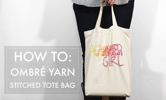
Make it Monday // DIY Ombre Yarn Stitched Tote Bag

If you have a chance I would run to your nearest Target and see if you can find some of their old Handmade Modern craft supplies on clearance.  On Saturday, I was strolling through my Target (the one that is 30 min south of me!) and stumbled upon a bunch of clearance craft stuff from the Handmade modern line - including a set of two tote bags and some mini balls of yarn.  I immediately snatched it up to create a fun stitched tote bag! 
this post contains affiliate links, please read my full disclosure here.
I liked the premade groupings of yarn because the created an obmre effect and also because I didn't need to buy full skiens of yarn to use 1/4 of a yard!  If you can't find these Handmade Modern kits see if you can find any kids yarn craft kits at your craft store.  Like the 'learn to knit' or 'learn to crochet' type of kits.  Often you'll only spend about $10 on a little kit but get enough yarn to make what you need.  
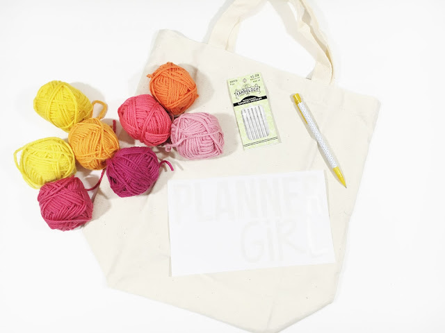
supplies // canvas tote, pencil, stencil image, stencil (paper, sticker paper, card stock, etc), metal yarn needle, yarn scraps, Cricut Explore or craft knife

For this DIY I also created a stencil you can use!  I've created PNG and a PDF for download here - if you have a Cricut Explore (or any other cutting machine capable of cutting a PNG image) you'll love this DIY.  If you need to trim the stencil by hand, just skip this little part here.
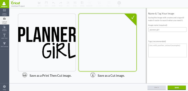
Upload the PNG to Cricut Design space by opening a new canvas, selecting Upload Images, and choosing the file from your computer.  Save it as a cut file since we won't needing to print then cut for this project.
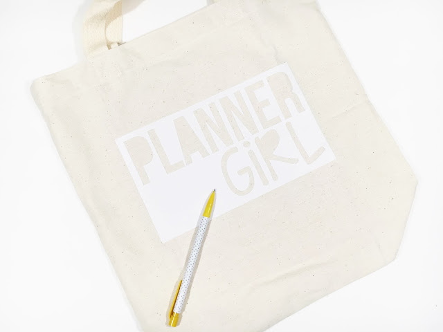
Add the image to the canvas and size it properly - for my tote the size was about 8 inches.  Then click Go.  I used sticker paper to create my stencil but card stock, stencil material, spare poster board or the like can be used to create the stencil.  Load the mat with the chosen media into the cutting machine.  Set the dial to cut the media loaded - for the sticker paper I have, variations of the paper setting will kiss cut the sticker paper.  Wait for your Cricut Explore to do the work for you!
Place the stencil on the tote bag and use the pencil to trace around the letters.  I found putting something hard in the tote bag will make tracing easy.  Remove the stencil and begin to stitch the saying onto the tote.
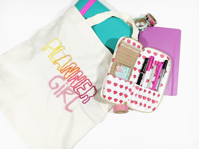
The best stitch to use for the block letters that spell PLANNER is a backstitch.  This creates a nice line of loops to outline the letters.  For the thinner letters something like a stem stitch works well.  I did not use an embroidery hoop, but that will help keep your work straight!

And now you're done!  A super cute tote to carry whatever you need!  You don't have to stitch this phrase, you can use the Cricut Design Space to create your own saying in your own fonts.  If you don't have access to a cutting machine like a Cricut Explore, the online design machine that is PicMonkey can totally help you out!
I love my Cricut Explore for quick projects like this.  When I have an idea the simplicity of Design Space allows me to quickly bring my idea to life.  The cut settings are easy to use - no removing blades and changing depths - simply rotate the dial or choose from various materials in the custom menu.  There is very little guess work involved and projects can go from idea to realization in no time!

If you want to create your own phrase to stencil here is a post on suggestions for combining fonts, but keep in mind how difficult it might be to stitch certain fonts.  And here is a list of all the PicMonkey DIYs on the blog for some design inspiration!

xoxo, Moe

3.08.2016

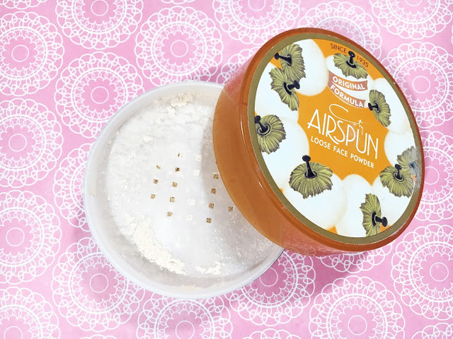
Beauty Review // Coty Airspun Loose Face Powder

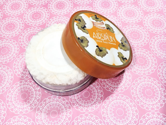
I've been trying to start this year out right by switching around my daily makeup every month and putting up my Makeup Baskets on my YouTube channel.  So far so good!  I found a product in the depths of my makeup collection - the Coty Airspun Loose Powder.  And it has changed my makeup game.  I remember using this waaaayyyyy back when and I've discovered a brand new way to use it.  It keeps my makeup on all day long!
From the Website
I can't find an actual website for the product, though this is the Coty website.  So this information is from the back of my packaging:
Featuring an exclusive Microspun formula where loose powder particles are spun and swirled until the reach a cloud like softness.  This ultra smooth powder hides tiny lines, wrinkles, and blemishes, and gives a new softness to your skin.  Use to set makeup or as a foundation.  Long lasting.  Dermatologically tested.
First Impressions and Application
First off - if you do not purchase the unscented version, be prepared to smell like an incredibly floral grandma for a bit.  Secondly - this powder is very, very messy.  The powder will go everywhere, believe me.
When I first purchased this powder way back when I used it set my makeup with the puff that is provided.  I pressed it all over my face to create a visible layer then used a powder brush to sweep off the excess.  I wasn't too impressed with this application.

Most recently I've been applying the powder with a damp beauty sponge - the Real Techniques Miracle Complexion Sponge.  This sponge has many sides perfect for various applications.  I use the flat side of the sponge for foundation, the pointed side opposite the flat side to blend in concealer, then the flip side (the long, smooth football side) to pick up the powder.  This long smooth side has a lot of surface area to pick up the powder plus a pointed side to blend the powder under the eye.

I use tapping motions to blend the powder into my skin, much like one would tap in foundation with a beauty sponge.

Wear Time
I find with a good primer and good, long lasting foundation this powder can give me a full 8-10 hours of wear.  At about the time my face starts to show oil (the 3 or 4 hour mark) my face still looks fresh.  The foundation hasn't worn off and there is very, very little oil showing through.  My face looks fresh, it is really nice.  By the end of the day a super close up of my face shows a little bit of breakdown, but not too much.  I'd say that even a photograph wouldn't pick up on the break down!  It is super impressive to get home after having my makeup on for 10 hours and feel like it is just starting to show some breakdown.

Additionally - trying to get this off with just a makeup wipe is crazy!! The product is definitely stuck on your skin and you'll pull your skin before you can get it all off!  A good cleanser is required for removal...but I'm not complaining!
Overall Impressions and Recommendations
All in all I would suggest you picking this up if you need your makeup to last a crazy amount of time.  The Translucent Extra Coverage shade that I have still shows up a bit pink on my skin but blending down the neck helps with that.

There are a few shades so it might take some trial and error to find your correct one and if you can find the unscented version, I'd go with that.  Mine has the scent and I've gotten used to it (sort of).  I still plan to use it because it has amazing lasting power!!

Are there any rediscovered products you'd recommend?

xoxo, Moe

3.07.2016

Make it Monday // DIY Glitter Text using PicMonkey

Holy cow, Batman!  Another PicMonkey tutorial!  Last week I shared a post on how to offer free printables on your blog and today I want to follow up with some inspiration to create a free printable (plus offer one to you!)  It's like free printable-ception - a printable with in a printable....but let's get back on track.
If you've been under a rock for the past few years you may not have seen that glitter is the new Gaga - glitter is everywhere!  And I don't mean that glitter has exploded all over your craft room, I mean glitter has exploded all over design!  So today we're going to use PicMonkey - the simplest, yet most amazing online design tool - to create a super cute glitter text graphic for your wall!
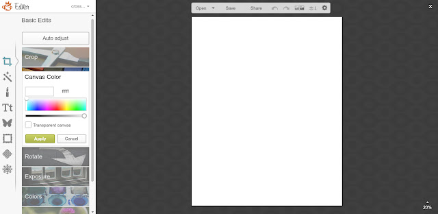
First, start off with a blank canvas by hovering over the design tab and clicking on 8x10.  Make sure the canvas color is set to white if it isn't already.
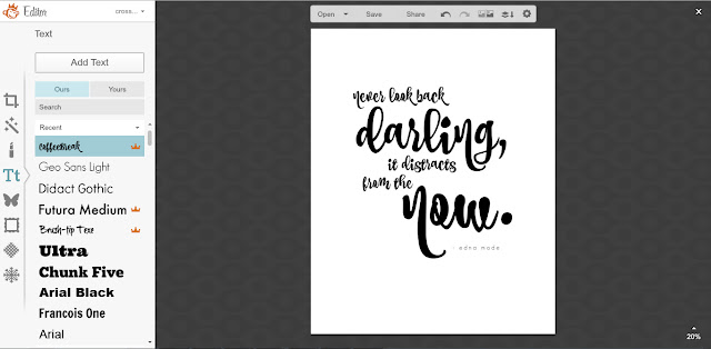
Navigate to the text pane and add your quote.  One of the greatest things about PicMonkey is that you can use your own fonts, for free, straight from the website.  If you don't have any cool fonts installed, don't fret - PicMonkey offers an array of fonts for free.  But there are even more fonts, overlays, and effects if you sign up for the Royale feature ($4.99/month or $33/year).  It is totally worth it!

I used the fonts Coffee Break (a royale font) and Geo Sans Light to create the quote on the canvas.  You could also add any overlays or dingbat fonts (see this tutorial here) to your design.  Be sure all text and other design elements are set to black.
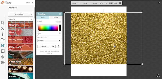
Once the design is finished, navigate to the Overlays pane (the one shaped like a butterfly) and select Choose Your Own from the top.  I downloaded this gold glitter image from Designs by Miss Mandee for this project so feel free to pop over there and download it for yourself.  From the Your Own menu, choose My Computer and locate where the glitter image was saved.  Select the glitter image you will use and click open.
The glitter image will appear smaller on the canvas but simply drag the circles one either corner to expand the image so that the glitter covers the entire design on the canvas.  Rotating and scaling can be done in a following step, right now just be sure the glitter image covers the entire black design on the canvas.
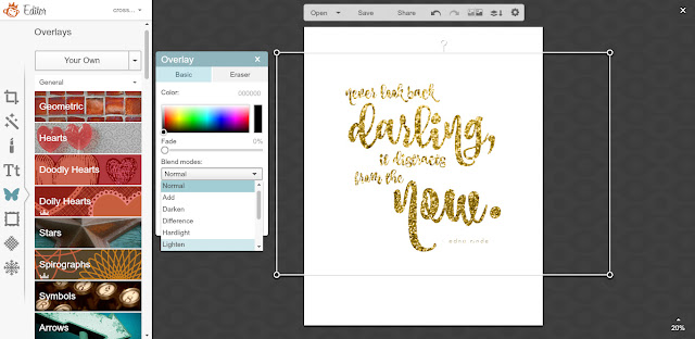
Next, from the overlays window that pops up once the overlay is selected find the Blend Modes drop down menu and choose Lighten.  This is where the magic happens - immediately you'll see that your text is now glitter!  Now you can rotate and scale the glitter image to your liking.  
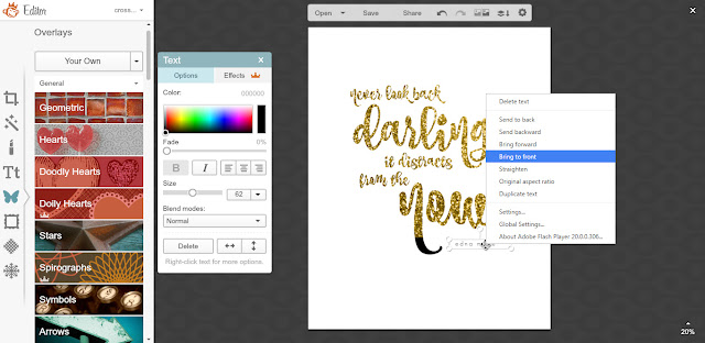
I move the glitter image up a little bit so that I could grab part of the design (the attribution of the quote) and bring it to the top.  The smaller stroke text doesn't really work well with the glitter texture so bringing it to the top and leaving it black adds to the design.

You don't have to do this with a glitter texture image - you can use any photo you'd like.

Now save your image.  You can crop if you wish to create different sized images (great for journaling cards or planner dashboards - remember the iPhone 6s crop size is the perfect size for a personal sized dashboard)
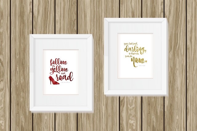
I've made two free 8.5 x 11 printable images for you using this method - both inspired by my word of the year Forward (read more about my word here).  One is an Edna Mode quote (I love The Incredibles!) and the second is inspired by my favorite movie The Wizard of Oz.  For the Wizard of Oz image, I found the red glitter here.

Download them both here.

Feel free to print these and hang these up as inspiration, but do not resell (printed or digital) as your own, do not redistribute for free on any websites.  Please play nice, these are for personal use only.  If you'd like to share these please link to the blog post so others can learn how to create some really graphics!

xoxo, Moe

3.03.2016

Boost Your Blog // How to Easily Offer Free Printables on Blogger

These Boost Your Blog articles have to be one of my favorite articles to write.  I love when inspiration hits me and I just have to share with you a way you can make your blog better.  This series is also a place for me to share what I've learned as a blogger over the years and today's post is something I've been doing for a lot of years.  Can you believe this blog is nearly seven years old?  I started this blog back in July of 2010 and it has evolved so much.  Maybe I'll do a post on my blog's back story....but today is not that day.  Today we are talking about how to design, host, and offer free printables on your blog.  This will work, generally, for any blog - I use Blogger so there will be some references here and there.
this post contains affiliate links, please read my full disclosure here.

It's super easy actually and you don't have to have subscriptions to file hosting websites or expensive design software.  All of the major options, including Blogger, are free.  Here's how to offer free printables on your blog:

Design your printable
There are quite a few ways to design printables for your blog.  You are probably aware that I am in love with PicMonkey as a free, online mini design machine.  It is so easy to use, full of amazing clipart, wonderful to work with, and you can use your own fonts.  You can upgarde, which I totally have, but using the free option is just fine.  You'll get a lot of use out of it.

With PicMonkey you can make any size canvas from the Design tab.  For my journaling cards I start with a 4x6 canvas and crop to a 3x4.  You can start with an 8x10 canvas or a custom 8.5 x 11 canvas.  The choice is yours.  Then you just design your heart away.

Another option is using Word.  While Microsoft Office isn't free, Open Office is and it is pretty much the same.  Any word processor is an ok way to design printables as well.  It won't be as powerful as something like InDesign but you can make it work.  I make it work every day!

Additionally, you can download the Silhouette Software for free and design there.  This is sort of like a backwards way to get around things but it can totally work.  When I'm on my Dell laptop that does not have Word installed, often I'll create a free printable in the Silhouette Software and save as a PDF.  That way I don't have to jump computers.  Half the time being creative is about being innovative!!

The important thing about printables is the file type you choose to save it as.  You can save it directly from PicMonkey as a .jpg because more often than not you can print it just fine.  But you may run into a problem with different types of printers.  An image might get printed to the right or left of the page if it's too small.  It may be harder for others to print a straight up .jpg.  I like to save my printables as a PDF for ease of printing.  I drop my journal cards into a Word document (or the Silhouette Software, but you could also try something like a document in Google Docs/Google Drive), resize, arrange, etc then save as a PDF.  It is easier for printing because you just hit print and don't really have to worry about it.  If you have a special sized image - 4x6, 8x10, etc - you may want to drop your image into a word document, ensure it is sized properly, and save it as a PDF.  If your image has a white background I usually add a thin border to the image for easy trimming.

If you can't save as a PDF straight from your design option down load a PDF creator - like CutePDF that acts as a printer to print to a PDF.  Simply install and choose the print option selecting the CutePDF as your printer.  

It is here that you also might want to think about watermarking to protect your work.  Since this is a free thing you are offering you may want to make sure your mark is on it somewhere.  Others who may not be so honest may see your hard work, sans a mark, and distribute it as their own.  A simple , small line of text with your blog name or url would be sufficient.  You can also learn how to make a watermark using PicMonkey here.

Hosting your files
Now that you have your final file, you need to host them somewhere so your readers can download them with ease.  I love using Google Drive for this!  Who doesn't have a Google account....really.  You get 15GB of space with your email address - between your Google+ account, gmail account, and your Google Drive.  I've been hosting printables on Google Drive for ages and have yet to run out of room.

In Google Drive you can host single files or create folders.  You can also upload .zip files.  This is great if you have a few printables in a set - like my budget printables - that you want to direct your readers to in one batch.

After you've uploaded your file you'll want to click on it and find the Share feature.  I always choose the option of Anyone with the link can view so that way I can only link to it from my blog and it's not searchable.  So the only way one can get to your file is if you give them the link - which you will because you'll link it on your blog.

You can also use places like DropBox or any other cloud based sharing site that will allow you to share the link so that your readers can view the printable.  (Because that is the whole point!)

Linking to your free printable
Now that you have your file hosted and you have selected to share it with others, you'll want to copy the link to share it with your readers.  Linking is really simple and you probably do it often in your blogging.  In Blogger simply type out your text and select it.  From the top menu select link, then simply past your link.  I always choose open in new window so that readers aren't directed away from my blog.

Now your readers can simply download the printable or print it from the webpage.  I also include a terms of use or disclaimer in my posts saying that this printable is free for personal use and not to distribute it.  This is just to remind others to play nicely, same thing as adding a little watermark - it is just a safeguard.

So there you have it!  A really simple and super easy and totally free way to offer printables on your blog.  I have used this system my whole time blogging and find it very, very helpful.  It's using three things I already use everyday and I don't have to sign up for anything else.

How do you offer free things on your blog?  Any tips for us?

xoxo, Moe

3.01.2016

Trend Tuesday // Current Favorite Photo Apps

Way back in the day I used to post camera & photo app suggestions all the time.  Then I realized that while I liked all the fun filters, I really did like trying to take realistic photos - or photos that could better represent reality.  The camera I use for my Etsy listings and my blog photos has been my iPhone for going on a solid like few years right now!  I haven't busted out my DLSR in ages.  
It took too much to run editing software on my ageing Macbook and because my phone was so portable I could edit on the go.  Meaning I could get work done on my lunch break, during a 3 hour car ride, while I'm waiting on a movie to start, etc.  While that sounds sort of insane - those extra minutes do add up!

Currently I have a rose gold iPhone 6s, an upgrade to my iPhone 5.  I would say 2014 & 2015 were mainly photographed with my iPhone 5, before that was my iPhone 4, and going forward will be my iPhone 6s.  I was reading some where that it wouldn't be science fiction for the newer iPhone models to have the quality of DSLRs.  With the mini processing power of these phones, you can even run Adobe products!  My dad blew my mind with his use of Lightroom on his phone.  Amazeballs!

Since 99.99999% of my blog photo work is done on my phone, I'm always in the market for apps that make things easier.  Apps that have targeted enhancements and apps that allow you to create your own filters or actions always get a download from me.

Afterlight
I have a whole review on Afterlight here on the blog, but I love this app because of it's simplicity.  The adjustments sliders are just right and the options are endless.  Honestly, I use this app everyday but I would say I've never used it to it's full potential - the creativity in this app is endless.
I mainly use the fusion option which is a feature that allows you to create your own preset filters.  You can create these fusions, save them, and email them to yourself (or friends) for other devices.  You can also add on to the fusion you've created and save it as a new preset.  When I open a photo in Afterlight I only do a few basic edits - brightness, crop, etc - if need be, but I mainly only use the fusion option.  This creates a cohesive look to the photos on my blog.  Every post has the same feel and these presets aren't too over the top.  The images are still realistic.

Snapseed
I've mentioned Snapseed in many posts on the blog but this is my favorite app for precision editing.  my favorite feature is the Selective function.  This allows you to target the Brightness, Contrast, and Saturation of a certain area of your image.  If ever I find the corners of my photo to be dark, I use the Selective function to bump up the brightness in that targeted area.  
The edits are subtle and fully controllable to create a subtly enhanced image.  Bump up the brightness, adjust the contrast, use the brush feature to adjust exposure (and more) in a more specific area.  I also love the heal feature for any blemishes on my zillion selfies.

ColorStory
This app is new to the app store and I've found the filters very helpful for creating that realistic look.  One of my favorites is in the Essentials Collection.  It is named Lite Bright and I love it because it makes the whole image bright.  Each filter can be adjusted for intensity
This app takes it slightly farther than Afterlight for me with a true curves feature.  I'll be the first to tell you though - I don't quite understand curves!!  But the other edits are amazingly adjustable.  Using this app you can create custom filters as well.  The only downfall to this app is you can't move the photo between apps to conserve space on your phone.  Some apps will have a feature that allows you to open the photo in another app right from the app screen - both Afterlight and Snap Seed have this feature.  Moving photos through different apps is my favorite way to conserve space on my phone while traveling - read more ways to conserve space here.

I miss trying all the new camera apps but I really have a certain look in mind these days so a lot of the crazy filters don't do it for me any more!  I even love how Instagram has offered up some new filters that are more realistic.  

You can read all my iPhoneography posts here.

What are your favorite photo apps?  Do you use your phone as your main camera as well?

xoxo, Moe