6.30.2015

Trend Tuesday // 5 Posts to Improve Photography

I've always liked the notion that the best camera you can use is the one you'll take with you.  Now a days we have amazing cameras right in our pockets - right next to our Twitter, Facebook, and Instagram feeds.  My iPhone is my go to camera because it is light, easy to use, and right there with me.  I can take a ton of photos and edit on the go - no need to upload to my computer, edit, etc.  A smartphone is so handy.

Up north I feel like as soon as Summer hits I want to take all the photos!  It is just so dark in the Winter time that it hard to get a lot of light to take nice images.  I love the warm tint to the photos you take in the Summer....just says 'yay warm weather' to me.  Light and airy images are hard to capture in the winter because there's like a slight blue tint to them.  Am I crazy?  Anyway, here are five posts you can find on the blog here to improve your photography this summer:

If you want to improve the way you look at life through your camera, I suggest this post.  There are 5 types of pictures to take to change the way you see your surroundings.  Changing your perspective will help you learn to see your surroundings differently and help you capture interesting image.

In this post I mention some easy tips to us the camera in your pocket.  In this post I share the biggest tip for interesting photos - composition.   The rule of thirds, as demonstrated in the photo above, is the easiest way to take interesting and well composed photos.  Most native camera apps and apps that allow you to take a photo will have the option to turn a grid on.  This lays a cross hatch pattern across the image so you can compose your photo in an interesting way.  Learn more about composition and pairing down your background to capture interesting photos in this post.

Create the Perfect Black and White Photo
There are so many camera apps that allow you to turn your image to black and white.  Sometimes the simplicity of an image translates well in to a black and white photo and sometimes you just want to add a bit of drama or just have fun with filters.  This post has 4 app examples that allow you to turn an image black & white.

iPhone Photos Become Blog Worthy
This post is an oldie but a goodie when it comes to editing your iPhone photos.  When I first got my iPhone, my favorite app for editing photos for the blog was Camera+.  Since then the app has updated but the tips are still true.  My current favorite photo editing apps are Afterlight & Snapseed.  Check out this post for tips on using Camera+.

Four Collage Apps for Summer Blogging
Collages are a great way to document many parts of a day.  If you want some fun collage apps check this post.  There are a ton of ways to share more than one image at once.  Collages are great for showing a process as well.  My go to collage app is Pic Frame because of the many frame options it offers.  I usually do a square canvas to post to Instagram but you can change the canvas size as well.  If you print photos for Project Life, Pic Frame is a cool way to add a collage to your layout!  See the full app review here.  If your into adding text over your images, check out this post on my favorite overlay apps here.

I hope this little round up was helpful in making your Summer photography a learning experience.  You can capture some amazing images with just your phone camera.  Please check out the iPhoneography category on the blog for more posts like the ones mentioned above!

Happy shooting!

xoxo, Moe

What are your favorite photo apps?  Any ones of note for Android users?

6.16.2015

Current Summer Make Up Favorites

If you haven't noticed, I've been pairing down my make up routine lately.  I'll start with a full face on Monday and by Friday I'm lucky if I even have on concealer. (My favorite concealers are in this post!)  See the thing is....I like to sleep a bit longer!  I've been just doing a bit of concealing, some lipstick, my brows, and mascara lately but on a recent trip where I knew I needed a foundation with a bit of SPF, I rediscovered a BB cream I got from Big Lot's of all places.  I'm not sure if you can get this anywhere anymore...the only listing I found was of one left on Amazon.
this post contains affiliate links, please read my full disclosure here
The Epielle BB Cream has become my go to foundation because it is easy to apply, light weight, but has a the coverage I'm looking for.  My face has gotten better recently - with redness and overall acne/breakouts - so I've been going for lighter coverage.  For some reason my usual full face, full coverage look hasn't been appealing to me.  I've been loving a lighter, fresh faced look....which is surprising!!  This BB Cream has SPF 20, claims to moisturize, prime, smooth, brighten, even tone, and protect.  It also says it has sheer coverage but I'm surprised at how well it evens my skin.  It is a great base for natural summer make up.
In addition to the BB Cream I've been setting my face with the Balm Sexy Mama translucent powder.  This is also something I rediscovered!  I love that it is light weight and I really do think it keeps me nice and shine free for a good long while.  The compact does have a mirror but no little sponge so it's not that great on the go - I am thinking about sticking it my puse though because I have a retractable kabuki brush with me.  
For blush I've been loving the subtle look of the Elf Mineral Blush in Jet Setter.  I have all four of the shades and a review + swatches of them all in this post.  Jet Setter has to be my favorite of all of the blushes in the collection.  It is matte and just the perfect shade of a natural flush.  I find this blush is perfect all year long.
As for lips, I've been going more natural if you can consdier it that.  Sort of the my lips but better shades.  I've been loving the Too Faced Melted lipstick in the shade Melted Fig for a while now and pulled it out again for the summer.  Some other natural colors I've been loving are the Elf Moisturizing Lipstick in the shade Wink Pink and the Wet N Wild Megalast Lipstick in Rose-Bud.  Side note: I can't wait to see if & when the Wet n Wild Fergie line comes out with anything crazy for the Summer.   Last year I snatched up all their fun lipstick shades!

As always I suggest if you're going to do any online shopping for beauty products to see what kind of deals you can score through HauteLook and Ebates.  The Balm is on HauteLook quite often so keep a look out.  Amazon also has pretty great deals on The Balm as well.  If you're shopping on the Elf website I just found that they are a part of Ebates now!  Ebates gives you cash back for shopping through their link - just go to the Ebates website, search the retailer you're looking for (like Eyes Lips Face) and you'll be securely redirected to the retailers site and if you purchase, you'll earn whatever the cash back deal is at the time.  I use Ebates any time I purchase high end make up online - I used it to purchase a Mac MSF through Nordstrom since Mac isn't a part of Ebates (plus I believe Nordstrom does free shipping! score!)

What are your go to Summer make up staples?  Anything new you're trying out?

xoxo, Moe

6.11.2015

Eight Overlay Apps for iPhone Users

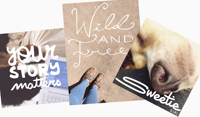
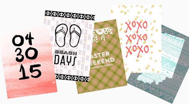
Recently the Paint Paper Studio app was released in the app store (designed by Olya Schmidt - follow her blog or instagram) and it prompted me to share some apps I love that have fun overlays.  You can use these apps to add fun sayings/clipart/doodles/etc to your photos oooorrrrr you can use them to create digital or printable journaling cards or stickers.  (Thank you Criss from StopnJotCrafts on Instagram, Facebook, and Etsy for sharing your crazy cool idea with me!)  I am addicted to photo apps and used to share a whole hell of a bunch here on the blog.  I feel like I need a million gig iPhone to store them all.  I'm so glad I have an iPad and an iPhone because I can hoard all the photo apps!

Here are my fave apps with overlays to add fun to your photos:
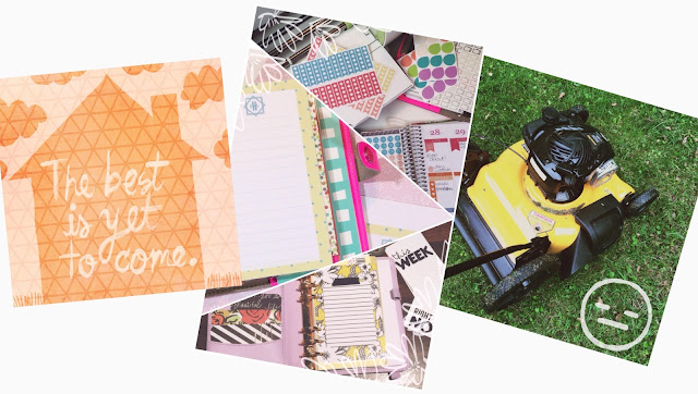
just realized the far right image in the collage is the ABM app + Paint Paper Studio
Paint Paper Studio - Free (in app purchases)
This app has a variety of hand drawn backgrounds that you can use or you can import your own image from your camera roll.  Artwork is provided by various artists which means you get a lot of variety in styles.  There are sayings and doodles included for free but you can purchase various packs to create even more designs.  I loooovvveee the polka dot patterns included in the app.  The only downside is that there is no custom text option so you can not add your own text.
This is the only app I've found with the largest overlay library.  They claim to have 38,000 graphics in their library!  To access the full library of overlays you'll need to be connected to wifi.  There is a new offline option but you don't get the full force this app has to offer.  Because there are so many option there are categories and a search option.  You can even visit the marketplace to find more licensed overlays (Disney, etc). Open photos from your camera roll, instagram, facebook, driver, and more!  You can create a collage or edit a single photo with some of the filters offered and add custom text.  You're not limited to just the predesigned artwork offered.  This app is truly an all in one app.

(I have a full review on Phonto and I've used TextMask in this tutorial)
These two are designed by the same company and pretty much do the same thing.  They are text over photo apps - one does a text mask where the font is filled by the photo you have behind it and the other is simply text over a photo.  The unique thing about this is that you can import your own fonts and create your own designs.  There are no true overlays in these apps but you can use the fonts to your advantage and create your own designs.  There are free and for purchase backgrounds and you as the designer have a lot of control over the text options.  You can align the text you've added, create a curve, etc.  These are fun design tools.  I have Phonto on all my devices and use it all the time for blog, Instagram and YouTube content.
This app was designed by the crew behind the blog A Beautiful Mess.  It features a bunch of hand drawn overlays - borders, frames, and doodles - but you can not add your own custom text.  You can design a square or rectangle image and the borders/frames will adjust to the design.  The overlays are in a specific style of the ABM designers so you won't get different artist's take on things but if you love the blog you'll love the overlays.  You can also create a single image or a collage.  There are fun collage options too - triangle, chevron, heart - to create a neat effect.
I love this app because of the unique mix of overlays, backgrounds, and font packs.  There are overlays for any occasion, fonts to mix and match with the overlay styles, and fun vintage wallpaper inspired backgrounds.  Out of all these apps I love the patterned backgrounds of the Rhonna Designs app.  This app has a text mask feature built in as well so you can adjust the opacity to get a fun look.  
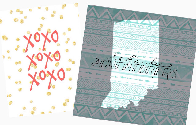
This app is new to me but it's pretty cool.  Import from your cameral or use the backgrounds provide and overlay really awesome shapes - including state shapes and greek letters for a sorority or fraternity themed designs.  There are a few font packs as well for adding your own text.  A fun feature that I haven't quite figured out how to use the best yet is the glitter feature. The overlays can be filled with a glitter design instead of a solid color.  There aren't too many overlays but the state shapes really got me (didn't you know I love our states?)  Unfortunately you can only save your designs in a square format which makes it great for Instagram but not my favorite for printing.
This app has fun hand drawn and script inspired text overlays to create inspirational images or fun dingbat doodles.  Change the colors of the overlays and add multiple ones to create a unique image.  The design of the app isn't fluid enough for my tastes as I find I have to do too many steps to delete an image but the artwork is unique enough for me.  There aren't too many overlays but the ones they have are really impressive for making journaling cards!

I hope this little round up has helped you find some apps to download and play with.  Even a search in the app store of overlay apps will return a lot of different ones to play around with.  You never know what you'll find, I'm always on the hunt for more.

What are your favorite overlay apps?  Any specific ones that just blow your socks off?  Please share!

xoxo, Moe

6.10.2015

How to Use DIY Digital Cards in the Project Life App

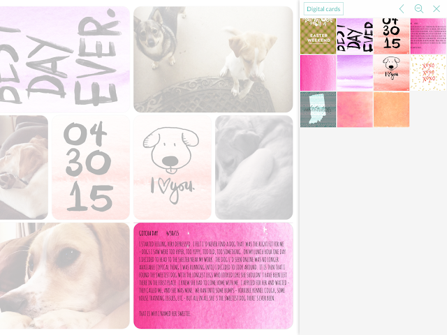
I haven't done a Project Life post in aaaggeeeess but I was thinking about how I could use the Project Life app...I thought it seemed fun but it didn't seem to suit me.  Then I realized I could use the digital cards I've made on my iPad in the Project Life app!  One of my favorite things to make are journaling cards because it's a small little design that I can whip up to just feel creative.  My favorite way to design on the computer is to use PicMonkey because of all cool overlays available.  You don't even need to upgrade to Royale to be able to make a great design.  I also have a few tutorials on the blog on how to make journal cards on your iPhone or iPad which make it very convenient to import right into the Project Life app.  I'll share those links below - but let's get to it.
Project Life App
The Project Life App is a fun and easy app to use.  You can import from your camera roll or dropbox, there are a variety of page layouts (both the 12x12 and 6x8), you can add journaling, you can add a colored background, you can add rounded corners or not, you can save, share, and send your pages to be printed right from the app.  Its like you don't even need to have your scrapbooking hoard anymore (yeah, said no one ever!)  The app is super convenient and offers quite a few of the Project Life digital kits both for free and for purchase.  They are always adding more kits, too.  I follow on Instagram to see when more are added.

Making Journaling Cards
I have a quite a few tutorials on the blog on making journaling cards - here & here using PicMonkey and here using some apps on the iPad.  There is also a whole list of my favorite overlay apps here.
The biggest tip I have for you making your cards is to play around with multiple apps.  You can make a single card between 2 or 3 (or more) apps to get the best design possible.  You can also find images on apps like Pinterest to use in your layouts.  (Remember though that these things should be for personal use and not for sale)

Using Cards in the App
As long as you have an image on your phone or you iPad you can import it into the Project Life app.  Since you can open from the multiple albums on your phone/pad you can create an album with all your digital cards you've made.
I like to just sit down sometimes and make random little cards with random little apps and add them to an album.  If you don't want to store all these cards on your phone, upload them to Dropbox to free up memory on your device.

Printing your Layout
The Project Life App allows you to export your layout to your camera roll at either the 12x12 inch or 8x8 inch (if you're doing the standard square layout) that way you can save your image for later printing or uploading.  The app also keeps the pages you've completed for later printing.  You can print to your own printer wirelessly or you can order prints through the app.  Of course, you can also share through Instagram as well!

I think that the Project Life app is another fun way to be creative on your iPad or phone especially if you like to play around with designs.  If you create your journaling cards and want to print them instead of use them digitally, email them to yourself or upload them to Dropbox or Google Drive and then print them from your computer.  Here is a post on how I use Picasa to print 3x4 journal cards and photos.

How do you get creative on your tablet or phone?  Are you a fan of different overlay apps?  Any collage apps to recommend for creating scrapbooking layouts too?

xoxo, Moe

6.08.2015

Make it Monday // Cheap and Easy ECLP Protective Cover

Did you know that the new Erin Condren Life Planners launch tomorrow??? Did you know??  (Did you also know that if you click here and sign up with a new email you can get $10 off your first purchase??)  In honor of my freaking excitement I thought I'd share with you a super cool way to protect your ECLP if you travel with it a lot or if you're just going to do some rigorous activity for a short while with it.  I don't know what you do with your planner...I won't judge.
This post contains affiliate links, please read my full disclosure here.
I'm a two planner girl now and I love the look of both my Filofax and my ECLP.  To give a little more protection to my ECLP in my purse I used an accordion folder from the Target Dollar Spot to create a fold over cover!  I couldn't find any of the cute colored $1 folders so I ran back to the office supply section and picked up a $6 accordion folder too.  So this DIY isn't too expensive to give you a lot of protection.
Supplies : scissors, ruler, marker, acetone to remove marker from folder (nail polish remover with acetone will work), large accordion folder with elastic, paper cutter (optional), craft knife & cutting mat (optional). 1/8 hole punch, ECLP or equivalent planner, small binder clips.
First, cut out the insides of your accordion folder.  You want to orient yourself with your folder too - the opening flap should be towards the right side, or the open side of your planner, like the image above. Keep this in mind as you're working on your cover so you don't get confused.
To make your front cover take one of the existing covers from your ECLP (I chose the front cover because it was easier to use the information section to line up the center between the two holes for the elastic) and trace out your front cover using your marker.  You want to align the cover in the middle of the folder at the bottom edge of where the plastic dividers used to be.  This is the front cover so you want none of the accordion folds on this cover. Avoid going towards the middle fold of the accordion.  Cut this out using your scissors, craft knife and cutting mat, or paper trimmer.  Any way you feel comfortable getting a straight line.
 To make your back cover (the cover that will have the accordion fold-over) align your existing ECLP cover to trace on the other edge of the middle of the accordion folder.  Keep the edge of your ECLP cover off of the middle part of the accordion folder with the two holes.  Trace just the left and right edges.
Using your ruler and marker use these two lines to make two longer lines stretching across the length of the left over folder.  This way we won't cut too much off when we try to create the part of the cover to fold over.  Using your paper cutter, scissors, or craft knife and cutting matt, trim off the excess to the left and the right.
Using your full planner, decide the thickness that the cover needs to fold over.  Since every ECLP is about the same I would say fold the first score from the rounded edge (the edge with the button) and then count down three score lines and fold there.  That should accommodate the thickness of your ECLP.  Next, using your existing ECLP cover, place it at the edge of the third score line and trace the bottom edge where the coil would be.  Trim off the excess.
Using the hole punch, align your existing cover to each new cover you've made and punch.  Make a slit in each hole to allow the cover to slip in and out.  The binder clips help keep the existing cover aligned so that all your holes will match up.
Using the extra piece you cut off when making the back cover (the piece with the middle of the accordion folder with the two holes for the elastics) line up the left and right edges then make a mark at each hole about an inch or less up from the holes you punched for the coils.  Do this on the back cover so that the elastic comes from the back, around the coil, to attach to the button on the front.  If it's too high up and your hole punch won't reach - just align and mark again a bit closer to the coil punches.  Use the hole punch to create the two holes.  Before threading the elastic back through these holes, use the acetone to remove the marker from the plastic.
And there you go!!  A nice, easy, and cheap protective cover for your ECLP!  I haven't decided if I'm going to purchase the new ECLP since I already have my old one...and it was such a good deal.  But if you do want to purchase one click here for $10 off your purchase when you sign up with a new email!!

Are you excited for the launch?  Do you have the old style ECLP or are you looking to switch?

xoxo, Moe

6.04.2015

Tips for Cricut Explore Print then Cut // Making Stickers

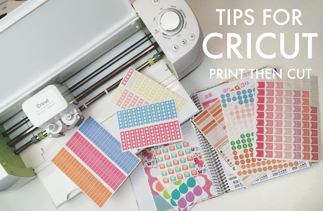
After much debate and the fact that Menards, of all places, had a pretty neat deal going on, I finally purchased a Cricut Explore.  That's right, I now own an electronic die cutting machine.  I've been wanting one for a while to experiment with making stickers....buying a machine like this for just one purpose was crazy, I know.  But, I have come to see that it has so much more potential - that I need to explore.
this post contains affiliate links, please read my full disclosure here

(side note: word of the year here! Explore.  Oh my goodness!)

But today I wanted to offer up to you some tips I've learned for designing for the Print then Cut specifically for making planner stickers....because you know I'm obsessed.  In fact you can find a whole bunch of FREE stickers designed right for the Cricut Explore by clicking here I couldn't find any info with tips for the Cricut Explore, it seems this is a Silhouette dominated world! So I hope this post is helpful.

Design a .PNG 'sticker sheet' in another program first

This is something I didn't do at first but Design Space kept crashing on me.  Design Space is an online design platform that uses flash.  So if you're familiar with using PicMonkey to design things you may have run into Flash or ShockWave crashes due to the way you're trying to push the program.  When I tried to use one little icon and populate the mat by selecting how many projects I was doing, ShockWave would crash.  Each. And. Every. Time.  So, instead of trying to create a 'sticker sheet' in the Cricut program I'd turn to a third party program to create my sheet.  (come to find out it was due to Chrome's Shock Wave and an independent Shock Wave plug-in, thats fixed now...but I do run into crazy problems more often than not.....) 

What I mean by sticker sheet is creating a .png image with a transparent background about 4x6 or 5x7 size filled with my icons.  This way the online design program doesn't have to work too hard to populate your stickers in the printable area.  Uploading this single, larger, image is easier for the mat part of the program to process.  The 5x7 size is the perfect size to fit on your mat as the Cricut can only cut an 8.5x11 piece of paper.

Why a .png?  Because the background is transparent you don't have to go through the step of removing the areas you want to cut.  A transparent background usually shows up as white and grey checkerboard in your design program.  It should automatically see the background is transparent and then make the cut lines around your icons.  I also put a slightly bigger white border behind my icons in the same shape because I don't quite think I have the calibration of my machine down.  You can use a design program or photo editing program like Photoshop Elements (what I used for the image above), InkScape, or PicMonkey to create your sticker sheetsIf you want to learn to design your own sticker sheets, check out my complete tutorial series here on YouTube. 

PicMonkey Photo editing made of win

Or Design in Design Space

After working with design space for a while I find it super easy to use.  The only downside is that you do have to be online to use the Circut Design Space but I found I could use the images/clipart/cartridges (??) like I use the overlays in PicMonkey.  I change all the images to print, instead of cut then design with them like they are clipart.  I found that using the attach option attaches any layers you may be using together so you can move them around your canvas.  In order to design a sticker sheet, I use the flatten button to create one grouped image after I've created a bunch of attached images.  This lets you populate the canvas with the sticker sheet you've designed in Design Space instead of having Design Space organize the images you made on the mat for print then cut.

Honestly, if you can get Design Space to work and you have a reliable connection the online editor does fine - much like working in PicMonkey.  However, your limited in making images to share.  You can publicly share the link to a saved project but if you ever stop using your Cricut or delete your account you may run into problems.  I like to have my freebies stay around long after I've forgotten about them (wink).  It's easier to host a PNG file and link to that.

Print then cut in the dark (or as close to it)

I bought a little rolling TV stand to hold some of my creative little things - like my printer, my laminator, and my Cinch.  The whole stand rolls in and out from under my desk and while the idea was to create extra space for myself by rolling the cart out from under my desk and then putting it away under the desk when I was done.  I am slowly having less and less space!  But my idea sort of failed because the Cricut really needs to be in the darkest space possible to get the light to read the registration marks.  I was having so many problems with the cut feature because the machine couldn't or wouldn't read the registration marks!  But putting it in the dark has helped and I rarely have problems now.  I recommend a shelf under your desk or somewhere that doesn't get direct light.  I find that even under my desk I have to turn off the ceiling light and just use the lights directly above my desk.  There is very little light leak now.

Cut using the  Washi Tape - 0.06m setting (if you don't have Cricut Sticker paper)

One of the biggest frustrations for me was cutting through my label and sticker paper that I got at Office Max.  I. Was. So. Pissed!  The Cricut Sticker paper setting is way too deep...it cut right into the mat!  But then I realized the custom settings are so varied that you can totally find the thickness that you need...with some experimentation.  I've used Avery Sticker paper and on the Office Max brand full sheet adhesive labels and that Washi Tape setting works wonderfully.  My current favorite sticker paper is this one from Amazon!!   The Cricut Sticker Paper setting is way too deep for label paper.  I bought some sticker paper and it is thick like scrapbook paper, for me that's too thick for stickers!

Find Your Printer's Ultimate Best, Most Best, Highest DPI, Most Bestest Print Setting, Ever

For the longest time I thought I was printing at the highest quality by selecting photo paper but I  still had prints that looked like they were printed at the fast print setting!  Eventually by poking around I found another setting that uses Maximum DPI.  I suggest googling your printer and finding the maximum DPI or best print setting for your specific printer.  This has made me soooo much happier!  The printer I use is like 8 years old!  It got a Happy Planner disc stuck in it too and STILL works!  Here is a newer version.

60off Happy Planners

Bleed for Print then Cut

I have a love-hate relationship with this feature.  It doesn't work well with the PNGs you design - I think it's because it can accurately create the bleed because the image isn't a part of the Cricut database.  So when you print it...it does weird stuff.  It works better with images already a part of Cricut.  Also, sometimes on a white background Circut will add a bleed of the center color of the sticker.....it's weird.  I have not tips for this function besides that you will probably want to do your own tests to see what prints better and how.

I hope these little tips are helpful.  I wanted to share what I learned from my first few uses of my Cricut Explore!  Like I said earlier, I couldn't find much on how to use your Cricut Explore for planner peeps!  I am planing on doing a few screen cast videos for planning as well - how to use PicMonkey to create icons for stickers, creating notes pages, etc.  Hopefully I can get my shiz together to get this done!

If you'd like to join in on more tips, be sure to join the Cricut Ready Stickers group on Facebook here.  Check out the Cricut sticker templates in the shop and the other stickers designed to print & cut with your Cricut here.

What tips and tricks have you figured out with your die cutting machine?

xoxo, Moe

6.02.2015

Undercover Lover // Concealer Favorites

I never, ever thought I'd say this - but recently I've become a concealer only gal.  Honestly, I haven't been wearing make up for the past few weeks and only recently have I broken out the concealer.  After Emmy passed so suddenly and with Zach gone, I was just in a lonely, depressed funk....as you could tell from late April and early May, I just stopped doing what I loved and make up fell into that category.
I used to wear make up to make up for the fact that I had acne prone skin.  When I was younger, when I first started wearing make up, it was to cover up every single thing on my face.  I used to have, well I still do have, redness and an uneven skin tone and blemishes.  The redness was left over from previous blemishes and I still have some scarring too.  The way my skin looked was something I was always aware of.  However, as I grew up I realized that make up could be something fun.  Over the past few years I've grown my make up collection because I like to try new things and I see make up as an extension of being creative.  I don't worry too much about my skin anymore, rather I love make up because it is fun.  While I may not do all out special effects make up, it is still fun to put together colors and looks.  It was the over all perfecting of the art that I loved!  I loved finding products that worked for me and I love trying new techniques.

With my recent sadness though I just stopped, it was too much work and I'd rather sleep than do anything I really, really loved.  My skin had gotten a bit better though so I decided to screw the make up and go bare faced.   I'm getting less and less random break outs and more and more hormonal breakouts.  I know that sounds horrible but I can pretty much predict and minimize my blemishes now - using my favorite blemish treatment.  I'd been slacking on my skin care, but I credit the look of my skin to my previous use of the Microdermabrasion Machine Zach got me for Christmas.  My break outs were minimal, even around my period last month...so I just let it be.  But, like death and taxes, break outs are certain to happen!  Soooooo I pulled out the concealers!  Long story short I've been loving these three concealer palettes all from the drugstore!  
The NYX Conceal, Correct, Contour is great for larger concealing areas mainly because there are so many colors.  I can mix the two lighter, skin tone shades to get a perfect color.  I like the way they blend and stay all day.  With some concealers I feel like I have to blend, blend, blend and the only way the match my skin is if i blend them in with my foundation.  My go to concealer is the Sonia Kashuk Hidden Agenda palette.  I love that the quad has a setting powder and a great green to counter act the red in my skin.  The green isn't that neon mint you find in other concealer palettes and that is why I love it.  It's just enough green to cancel the red but it's not to hard to blend into the skin and to use the other shades to make it match your skin.  A newer palette is from Flower Beauty and it is called the Hollywood Secret Concealer Kit.  This one has a perfect green to conceal red with as well.  The consistency of the green shade is the consistency I love - not too oily feeling, not too thin, not too thick, kinda sticky - and that makes it stay on longer.  This is a great alternative to the Sonia Kashuk palette (especially if there isn't a Target near you) the only difference is that there is a brightening primer instead of a pressed powder.  If you're using this quad as a part of your full foundation routine you might find more use out of it.  The concealer shades aren't my absolute favorite but since Target is so far from me, Walmart is a closer option!

Since my little rescue pup, Sweetie, has come into my life and because Zach is now back for a bit (yay!) I'm feeling happy again.  It is so weird how life affects you sometimes.  Here's to more sunshine in the future.

What are your favorite concealers?  Have you ever drastically changed your make up routine?

xoxo, Moe

6.01.2015

Make it Monday // DIY Home State Art in PicMonkey

You probably already know that I have a thing for states.  Like some people love monograms, I love our states.  (See posts here & here for proof.)  One of my favorite dingbat fonts is State Face (See my other favorites in this post!).  A pretty cool feature of PicMonkey that I love to use is adding the fonts I've downloaded to my computer into my designs.  Today I want to share how to make a fun little state print using PicMonkey.  You can adjust this print to make journaling cards, a post card, a background for your phone or your tablet, stickers for your planner, or just to hang on your wall when you're far from home.
this post contains affiliate links, please read my disclosure here

Supplies - PicMonkey.com, State Face font (free download), pattern from ColourLovers.com, printer, choice of paper (photo paper, card stock, etc) paper trimmer
First I browsed ColourLovers.com to find a pattern I liked.  This site is one of my favorite resources for free for personal use patterns.  There are so many colors, designs, and patterns to choose from.  I saved the largest resolution option and opened it in PicMonkey.  I decided to make a print 5x7 so I cropped the image down to that size.
Using the font option I added the State Face font to my canvas and decided to go with our current state, Indiana.  Just type out the alphabet until you find your sate shape, there is even the USA shape in the mix too.  Since there aren't any grid lines in PicMonkey, I eyeballed the center of the canvas and placed the state there.  I also used the fade option to change the opacity of the state I chose.
Of course you could be done here but I wanted to add a nice quote about home to my print.  I used another font from my computer but PicMonkey has a ton of free fonts.  But if you'd like to upgrade to Royale you get access to a bunch more fonts, effects, and overlays.  I subscribe yearly for $33/year.  There is a monthly subscription as well for $4.99/month.  Not to bad for an amazing photo editor and mini design machine!  If you're interested in signing up, please click here.

I usually print images through Picasa.  Picasa offers size options to print your images/photos so you don't have to make any sizing adjustmenst.

I hope this little DIY was inspiring for you.  I am going to put this as my home screen on my phone since Zach will be heading to Korea again soon.  We're also almost done with the house so Home has a whole different meaning too.  Even though I've been out of Virginia for nearly 4 years I still get homesick every now and then.  I think it would be neat to make a whole set of prints with where we came from and where we are now.

What quotes about home to you love?  Do you ever get homesick?

xoxo, Moe

ps. Find all my PicMonkey tutorials here and all the DIY's on the blog here.  If you'd like to have the iPhone background click here, for the 5x7 print click here, for the 3x4 journaling card click here.  All are .jpg images so right click and save the image to your desktop.