11.21.2014

Uncommon Goods Holiday Gift Guide // Personalized Gifts

I can't believe we are another week closer to the holidays!  Honestly I am counting down the days until I can see my family.  Unfortunately I won't be spending Christmas day with my family but I will be traveling down from Indiana to Virginia.  I've already booked my flight and I've already thought about packing!  Is that too soon?
I've been thinking a lot about gifts this year and how sometimes we just find something that is sort of meh to give to our loved ones.  Sometimes it's too stressful to find an meaningful gift that is so perfect for someone that we may just settle for mediocre.  That got me thinking about what kind of gifts I could give that would tell a story.  How can I share with my loved one that I care about them through story telling?  That is when the idea of personalized gifts hit me!  Today I want to introduce you to a site that has an amazing selection of items that are perfect for anyone in your life.  From this selection here of gifts for him, to something for her right here, you're bound to find the perfect something that just suits them so well.  What site am I talking about?  Uncommon Goods!

Uncommon Goods approached me to review a product just in time for the holidays.  While looking through their assortment of quirky and mostly handmade items I cam up on the perfect gift that would tell the story of us....and it's an amazing one.  I chose these State Love Glasses personalized with our initials, date we met, and the state Michigan (for Zach) & Virginia (for me).  When I saw these I knew they would be perfect to surprise Zach with.  It was such an ordeal and a big part of our young lives meeting and then moving 800 miles north to start a life together.  This personalize gift just spoke to me in a way nothing else had in a long, long while.
First off, let me introduce you to Uncommon Goods.  In case you haven't heard of the site Uncommon Goods - let me fill you in.  Uncommon Goods is a privately-owned retailer headquartered in Brooklyn, New York that features unique designs and hand crafted gifts.  They are a company that stands for designers by holding a high respect for the creative individual.  Uncommon Goods is a company that gives back to it's workers and contributes to the community.  I highly encourage you to check out this page of their website where it is outlined how the privately own company contributes to various charities such as RAINN, American Forests, and Women for Women International.
Now onto these State Love Glasses that are so impressive!
I chose these glasses not only because they could be personalized with something so close to us but also because I wanted to see the quality of the etching.  Sometimes, when you get an etched glass, the etching seems to sit on top of the glass and not look like the glass is, in fact, etched.  I wanted to talk about this first - over the packaging and anything else - because when I opened the box I uttered a wow.  The quality of these glasses would impress anyone who receives this gift.  The etching also stands up to hand washing.  The site recommends not to place this in the dishwasher and in order to make any etched glass wear last, you really should wash by hand.

Since many of the items sold on the Uncommon Goods site are handmade I feel a connection to the designer behind these.  On the listing page here I learned the history behind the designer who imagined this product and then in the actual packaging the story was printed again.  As a lover of stories and a person who is intrigued by how we are all connected, this feature touched a personal spot for me.  I love that I was able to bring a unique piece of practical art into my home.  The quality ensures they will stand the test of time and I can't wait to keep them on display for others to hear the artist story as we share our own.
These arrived in a box filled with peanuts, wrapped in bubble wrap, and securely wrapped in brown paper.  When I felt the weight of the box, I thought that it might not be packaged well because it was so light but I was totally wrong.  Whenever I am anticipating a personalized item like this I get a bit nervous that something will be damaged.  However the packaging and care that went into packing up this item really ensures that you will get your item in pristine condition.

A personalized gift is a great way to go to show someone you truly care.  There are a ton of unique an personalized gifts in the Uncommon Goods gift guides here that are sure to make the best impression with your loved ones this holiday season.

What kind of personalized gift speaks to you?  Have you considered how story telling could be incorporated in a gift for your loved ones?

xoxo, Moe

**This item was sent to me for review from Uncommon Goods.  The opinions expressed above are my own.  All information about the company Uncommon Goods can be found on their website here.

11.20.2014

Boost Your Blog // My Blogging Kit 2.0

About two-ish years ago I did a post on creating a blogging kit if you were moving, traveling, or just somewhere that you weren't used to.  I created this kit to keep me sane in my transition period from moving up to Michigan.  Which, let's talk about how young I was 2 years ago for a minute.  I stumbled up on some of the emails between Zach & I while we were apart (read about our long distance thing here).  Oh my gosh we were so, so, so young!  Some days, when I find things like that, I wonder why I felt so confident in my decision to move up here - I was so young what made me so positive this was going to work out?  Don't get me wrong, this has been the best thing but it could have gone so bad.  We've grown a lot together and it's so weird to look back on how young we were.  You sure don't know time has passed until you turn around and look at it.  Jeeze.  Anyway, that's not what this post is about.  This post is about my blogging kit 2.0.
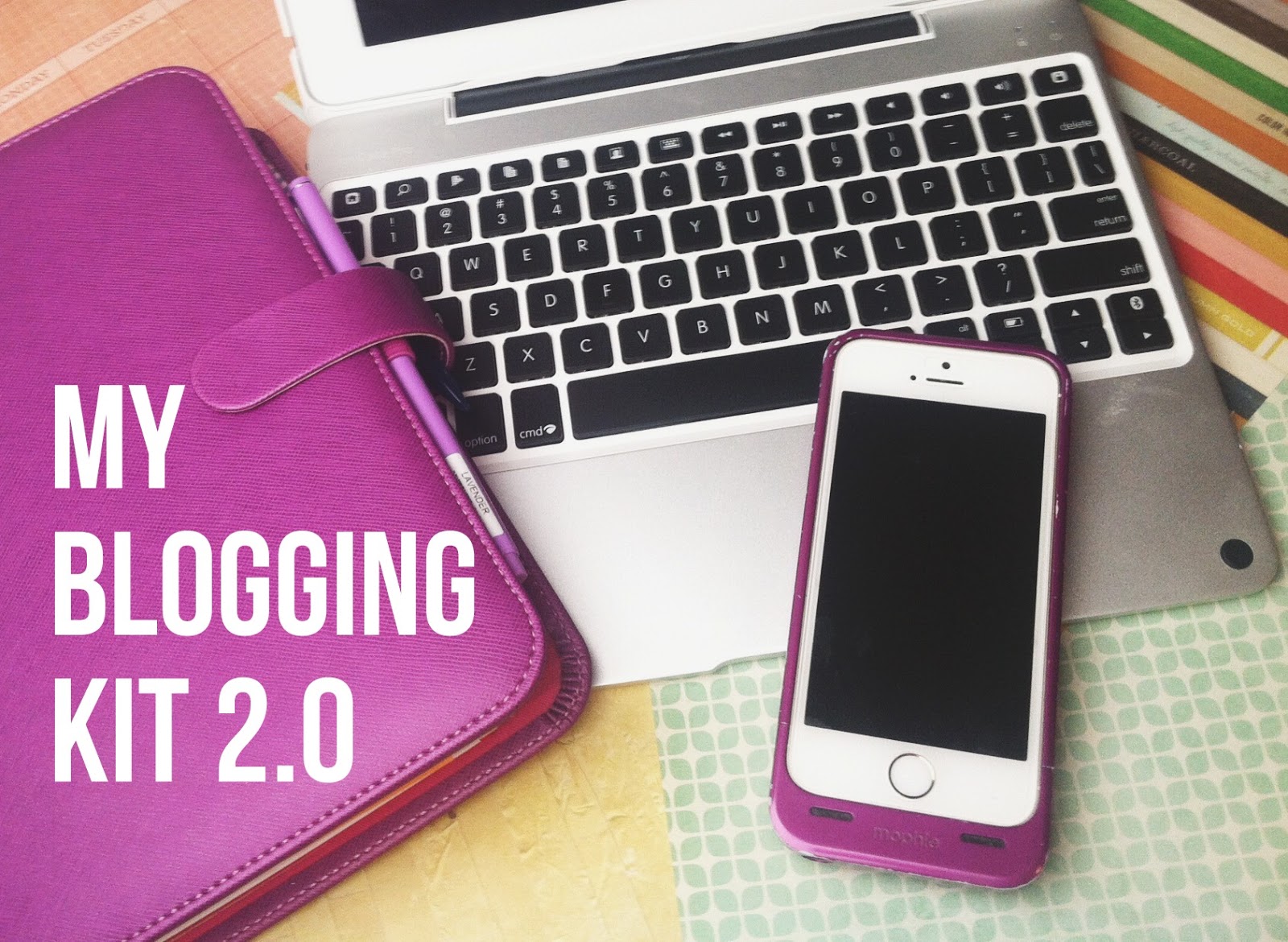
Now, I don't travel with Zach at all any more (sad face!) and for the most part our travels involve going to different SCA events and during that time I'm not really connected to technology because we're usually camping.  But currently I'm in the state of a remodel and in order to gain control over my surroundings I thought I'd assemble my blogging kit just to give me some control.  I think I am more than slightly Type A when it comes to some things!  So here is the Blogging Kit 2.0 :

iPad & ClamCase
Something that has become super convenient for me is my ClamCase for my iPad.  It turns my iPad into a mini laptop which is perfect for on the go blogging!  This is great if we're making a little weekend stop to Zach's parents or a small weekend trip I can still get some work done.  It would be even more helpful if I had a 3G plan but wireless is just fine for most things.  (Read about blogging from an iPad here.)

Filofax Planner
This takes the places of my blog planner and blog idea notebook.  This planner is filled with everything from plans for my daily life, blog plans, contacts, to do lists, and other planning things.  I feel like this is the big girl version of the planner I used to have.  I've sort of updated how I plan for the blog but it still follows the same principle.  Also this planner holds my sticky notes and pens so I don't have to bring another case with me.  If you want to see an easy an affordable DIY binder planner check out this video on my YouTube channel.  I also posted a current planner tour here.

Camera/iPhone + Mophie Case
I hardly pull out my DSLR anymore.  I'm still fighting with it so I've just been using my phone.  I currently have the iPhone 5s, and upgrade from the iPhone 4 I had in the previous Blogging Kit post.  With the 5s comes a better camera so I can really have blog worthy photos.  I'm hardly ever worried about my phone dying because I have a Mophie case that has one full charge as a back up.  So I can take really great photos and not worry about lugging around a camera or a camera dying on me.

App Arsenal
I talked before about the ways you can blog from you iPad and there really are tons of apps out there to help you along (currently I'm liking using the actual Blogger app).  But the other thing I worry about is the fact that I have the lowest memory option for my iPhone so I need to back up my photos incase I need to delete.  My whole blogging app arsenal includes Blogger, Blogsy, Google Drive, Afterlight, Phonto, and PicFrame.  All of these give me everything I need (nearly) to compose a post.

Storage 
In the last blogging kit post I talked about storage for some bits and bobs you may collect from events, travels, etc.  Because my Filofax (the Saffiano in Rasperry) has quite a few pockets and inserts I can slip anything I need to keep in the various places in my planner.  There's really no need to have any extra baggage.  All my sticky note are on various flyleafs in my filofax, washi tape is around an old gift card and my pen is in the pen loop.  If I do need highlighters, I do have a separate pencil case in my purse.

So that is my big girl Blogging Kit 2.0!  I love that everything fits in a space no bigger than my iPad.  I guess the kit grew but I think it also got more efficient now that I have a whole app arsenal to create pretty sophisitcated blog posts on the go.

How do you blog on the go or when you're in a state of transition? Are you a control freak when it comes to spending time in unfamilliar territory?

xoxo, Moe

11.18.2014

Trend Tuesday // My Favorite Teas

I've been drinking tea a lot lately.  It's been a night time ritual for me to brew a cup through my Keurig and I've added tea storage to our little coffee nook!  I thought I would share some of my favorites today because I'm thinking of repurchasing some samples I've had and it seems Amazon has the best prices for everything.  Currently I'm loving Jasmine tea and find myself drinking two cups a night!  But here are the rest of my faves:

Yamamotoyama Jasmine Tea (cheap but it's the one I've been going to!) // Red Rose Lemon Chiffon Tea (if you love light, lemon flavors...this is so yummy!) // Tazo Well Being Rest tea //  Harney & Sons Caribe flavored green & black teas (I got a sample of this and fell in love!)

Do you have a fondness for tea?  What is your go to relaxation method?

xoxo, Moe

11.17.2014

Make it Monday // Create the Perfect Black & White Photo

My everyday camera is my iPhone.  This means that a lot of editing gets done on the go with various apps.  (You can find more iPhoneography tips here.)  Sometimes, because I'm on the go and trying to capture the moment, the image quality isn't the best.  The image may not be composed well, there may be a blurry part, or I might have used the front camera.  Whenever there is an image that captures the moment but it might not be the best reflection of my photography skills, I make it black and white.  That instantly saves the image!  Here is are four apps you can use to create the perfect black & white images
9 times out of 10 you're posting a photo instantly to Instagram, right?  Well Instagram has two great black & white filters that you can amp up with some of the in-app editing you can now do.  Did you know that?  If you click the little wrench icon you can do some basic edits like brightness, contrast, highlights, and shadows.  Those four edits are the ones I use nearly every time I post on the app.  But when you're using a black & white filter, these edits can make your photos pop.  You want enough contrast to show all the details but you don't want the white blown out - these tips are for all apps we're going to be using in this post!  Any way, the two black & white filters are Willow & Ink Well.  Ink Well has a sharper contrast that tends to give you that true black & white crispness and Willow gives you an old Hollywood look with a softer feel and less contrast.
Here you can see that Willow looks lower contrast and has a different tint to it and Ink Well is high contrast and more true to black & white.  When I have a portrait image or an image that is less busy, that I want to be black & white I tend to use Willow.  For a busy photo where you need the high contrast to show all the details I tend to use Ink Well.   I don't like to use these filters straight from the app, I like to edit them using the wrench feature and the brightness, contrast, highlights and shadows  sliders to make sure all the details pop.  Where the blacks are black & the whites aren't blown out. 
You can see (click to enlarge the image if you wish) the edits are subtle but in the end, the last photo, you can see the details inside the cup as well.  It's not as dark as the filter straight out of the app.  Also the whites are also a bit brighter.
Here are some things you want to avoid when making your photos black and white - the brightness in the image on the left is too much here, there are few true blacks.  The contrast in the middle image is too much, there are few details especially in the cup.  The last image on the right is blown out all around because there is too little contrast and too much brightness.  There are no true blacks, too little contrast between the details (like the stripes on the blanket), and the whites are very blown out.
So here is the final image.  The edits are subtle but believe me the whites are whiter and more details are there.  Instagram is a great go-to editing app because you're gonna be sharing your photos anyway and you don't have to open multiple apps to get a good black and white image.

VSCO cam has a bunch of filters and it's a bit simpler to create the perfect black & white image because of that.  However, it is also much easier to find the correct preset you love and edit from there.  I have nearly all of the filters in VSCO cam from various in app purchases and VSCO cam is pretty much like photoshop actions for your phone.  The possibilities are endless.
You can see above (click to enlarge!) that these are 5 black & white options.  Each has it's own little twist - a little more contrast or a little less, a matte look, brighter whites, etc.  Sometimes you'll need to play around with a filter to find the best one for you.  You can also correct your image first then convert it to black and white.
I just did a little bit of edits before I converted to black and white.  This isn't my favorite way to edit when working with black and white photos but if you know you're going to need to bump up contrast, etc you can get a corrected photo, convert to b&w, and the make any other minor adjustments to bring your black & white photo up a notch.  That is what I did using VSCO cam.
After I did my edits above, I chose my filter.  I then realized that the details in the cup were hidden because of the shadow so I tried to bring those details out.  The X1 filter also gives a matte look to the image and here the whites aren't as bright as the could be.
Afterlight
I hope you're getting the idea here but another app to play with for black & white is Afterlight.  There are a zillion (not really) filters to begin with but the black & white filters in the app are fun to play with.  You can find them under the Original option.  (You can also read my full Afterlight app review here.)
Here are the three filters in action.  I applied these filters over the unedited photo.  Are you sick of looking at this black & white mug yet?  Well Afterlight has something else to offer that the other apps don't!
An option Afterlight has that these other apps do not is the option to save a fusion - or your own, personalized actions.  So say you want to apply the exact same black & white (or any other combination of edits) to another photo, you can create a fusion, name it, and select it later to apply to another image!  Cool right?

Snapseed
Snapseed is an older app, if I'm not mistaken, and it is the first photo app I remember really loving because of the controls.  Another part of this post is that you may find that you like the controls in certain apps over others even though the end result is sort of the same.
Snapseed has six edits for black and white with different brightness, contrast, and grain settings.  The other apps do not have an auto grain setting.
You edit the images by swiping up or down to select brightness, contrast, and grain then swipe left or right to raise or lower the selection.  You can go back and forth between the edits as well to make sure you have the settings the way you like.
You can see the grain does something different for your photos.  I don't prefer the grain, however it is an option and has a lot of control in the app.

So these four apps are great for editing black & white photos!  Sorry for the picture heavy post but I wanted to share every option for you in these apps.  I hope you'll find one to download and play with!

How do you make your photos black & white?  Any other apps to try?

xoxo, Moe

ps.  I used Picmonkey to create the app collaged.  The collage feature is totally free but if you'd like to check out the Royale (premium features) for a day, click this link!  You can also sign up for a yearly or monthly subscription to the Royale feature here!

11.16.2014

BH Cosmetics on HauteLook

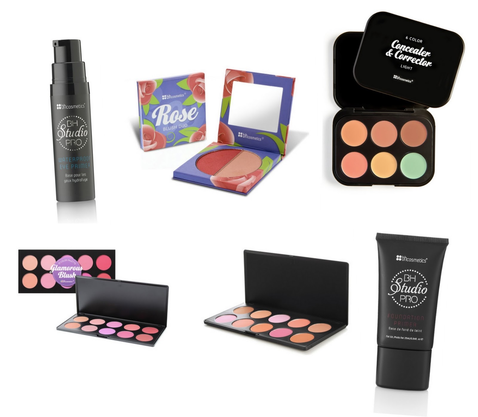
Hey there!  Popping in for a quick little Sunday blog post to share with you an affordable brand that just got even more affordable by being featured on HauteLook.  If you've been reading the blog for a bit you may remember my BH Cosmetics haul & review here from back in the summer.  I was super annoyed and not satisfied with a lot of the products...so I only recommend a few products & when they are on sale.  Well here it is...BH Cosmetics is on HauteLook!  Head on over here - sign up if you need to, you won't regret it! - and get you some discounted BH Cosmetics!  Guess what, you can even use Ebates to get money back for shopping online too.  If I wasn't on my no-buy (which I already violated because of the stupid CVS beauty clearance) I would totally be all over this.  Since there are only a few things I would actually recommend from this brand, I'll just share them with you now:
I love the 10 Professional Blush Palette and would venture to guess the 10 Glamorous Blush Palette would be of the same quality and for only $7 you can't beat it.  I recommended the Concealer & Corrector palette in my concealer video - the perfect time to pick it up on sale for $5, a good price for what you get.  This palette is really only good for highlighting with the three skin tone shades and the single yellow corrector shade.  Word of caution though, the shade pictured in the collage above is the shade light and the image on the website is not true to color.  Light is way light not the medium sort of look they have going on here.  I also think the Blush Duos are at a great price of $4 to pick up.  Some of them have a blush and highlight duo thing going on.  I hear good things about the eyeshadow primer and the foundation primer though their original prices are around $15 & $20, snagging them for around $9-$12 is stupid great especially since you hardly know if you'll be satisfied.

Just thought I'd share if you've been wanting to try somethings or want to pick up somethings you may love, head on over to HauteLook and check it out.

11.14.2014

Modcloth Holiday Gift Guide // My Top 3 Faves

**This post contains affiliate links, and I will be compensated if you make a purchase after clicking on my links.

Did you know there are only 42 more days until Christmas 2015?  I can't even believe it!  I have to say that this time of year is my favorite.  I feel like everyone puts aside their differences to come together - except when there is a huge fight over the last whatever the tickle-me-elmo will be of the 2014 shopping season.  Any who, it is time to mention the Modcloth gift guide (don't worry I have another gift guide coming up soon too!).  I've picked out my top three favorites from the gift guides on the Modcloth website.  Here are my picks:
First off when I saw the Yule Be in my Heart Sweater in the Holiday Fun Guide it was an instant fave.  Anything to do with gnomes and I'm all, all, all over it.  The cute little gnome just gets me!

Second, this Gatsby inspired friendship necklace is so cute.  Last year I gave Katie a Tardis Friendship necklace that I love but seeing this West & East necklace just makes me so sad that we are so far apart!  I found this necklace in the Gifts for Gals Guide.

And finally, this corgi plush just kills me! He is so cute!!  I would cuddle with him so hard but I do have a real life corgster to cuddle to death.  If you need some corgi in your life, you can find him in the Quirky Gifts Guide.

Modcloth always has the coolest gifts around this time.  Of course, they always have the coolest gifts all year round but if you're in a pinch you can't go wrong with anything on their site!

What are your Modcloth favorites?  Have anything from years past that you still love?

xoxo, Moe

11.13.2014

Revisiting my FOCUS

Way, way (way, way, waaaayyy) back toward the beginning of 2014 I decided to do this thing called One Little Word.  And by do this thing I mean take something I saw on the internet and run with it only having a small understanding of it - you take one little word and live it for a year.  I am so, so, so very bad with goals, I've spoken about it before, and about mid year I realized I'd completely given up on this One Little Word thing.  Or had I?
My word for 2014 is FOCUS, my first (maybe only real post on it) is here.  I talked a lot about refocusing - the blog, the shops, etc.  I talked about expanding the Zazzle store, I talked about doing YouTube videos.  About mid year I realized I hadn't mentioned my word nearly at all since that post.  But in reflection, I'd found that I had be focusing on things....just not in the way I intended.  This is what always happens to me with goals.  I set them and then forget about them but in a round about way get back to them and feel accomplished in the end.  That is how I feel about this little word here.  I did end up focusing on a lot of different things in my life.

I started off by doing the Four Simple Goals posts each month with the goal in mind to focus on our relationship (between Zach & I and us as a family), focus on the house, and focus on a 516 endeavor.  While I started out different than where I ended.  I'm glad I'm ending where I am.  It's weird how things have worked out...you know?

Focus on Us
We started doing more things together with intention and we are growing together everyday.  I try to make it a point every now & then to just sit down and be together.  We play games, we watch shows, we just hang out where it's just us....and the dog!  We've also started going to SCA events where we learn a lot about different, historical things and just have fun socializing together.  I think that Project Life has helped me focus on us because I'm documenting our lives and reliving memories.  I especially want to point out this post on how we just decided to move 800 miles away together.  It is so funny to look back on things and be surprised.  I've also focused a lot on me and who I am (this post and this post and this post reflect that).  This has helped me identify what I bring to the table as being one part of the us I'm talking about!

Focus on the House
A lot of small projects got done this year.  A lot of organizing and consistency happened this year.  I worked on a cleaning schedule and we finished some of the odds and ends that needed to be done and we started some new ones.  This year was about appreciating the space we have and making the most of it.  We have a long way to go and I'd like to continue focusing on the house in 2015 because theres a lot to do.  I feel like it's a constant struggle for me with upkeep!  Who really wants to rake leaves and mow the grass? Not me!

Focus on 516 
This was a big one.  While I didn't expand in the areas I initially mentioned I branched out and tried new things.  I also went back to blogging just for me.  I am keeping my sidebar ads down because I want to promote things I love.  I'm keeping my shops down because I don't want the pressure and it's not always about $$.  It's about creating!  Offering freebies on the blog was another big step.  I always tend to want to sell what I've created but freely sharing has made me happier.  I feel like with Project Life I've renewed my love of design, but in a new light.  My YouTube channel and my love of make up has really been a way to be creative as well and show my artistic side.

So there's just a little update here before the end of the year.  I might take this little project further next year.  I'm already thinking about what my word will be next year.....what is a good, over arching word that I can apply to my life?  I like focus because it has an action so I want to choose a strong word next year as well!

Did you choose a word to live by this year?  Will you choose one next year?

xoxo, Moe

11.12.2014

5 Tips for Organizing Project Life Cards

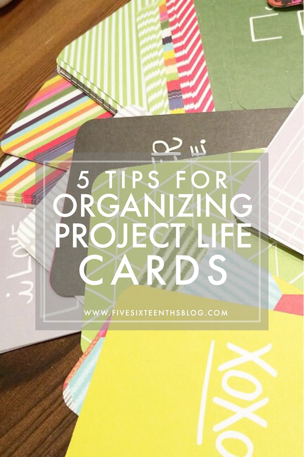
Now that my love of Project Life has been renewed, I'm back to sharing some tips for you! I've found that the biggest problem is organizing the cards to easily be able to find them in the middle of shoving pictures in to pockets.  Let me tell you - I love pocket scrapbooking for a few reasons (outlined in this post) but the biggest reason is that it's not intimidating.  I don't have to fill a whole 12x12 page with carefully coordinated papers - I just cut photos slip in pockets, add journalling, and I am done.  Now, if you're big into flair and decorating - good for you, that's totally an option.  However, for me.....that's not what I'm into.  Pretty much I just use the pocket cards.  I tried to use little labels and elements and it just was too much.  Simplicity is what I'm after!
I went through a few ways of organizing my cards when I had one core kit and a few little kits but now that I have 4 core kits and a bunch of cards printed from blogs & cards designed by myself - there's a lot more to organize!  Here are my 5 tips:

Choose your side
The biggest tip I've found - and forgive me, I don't remember where - was to sort through your cards and choose the side you like.  This way you're never flipping cards to see what's on the back.  When I get a kit I open it, giggle like a kid on Christmas, then sort through the cards and align them the way I want.  I grab a stack then pick & flip.  If I like the front of the card (as it's laid out in the kit) I set it down with the front facing up.  If I like the back of the card (as it's laid out in the kit) I set it down on my table with the back facing up.  This way I'm aligning the cards in the way I will put them in my card organization system.  The side facing up will be the only side I will ever look at (sounds scary huh?).  If I like the back and the front and I can't decide - half go front facing and half go back facing.  That way I have a variety.

Sort your cards by color
I find that I'm motivated by color.  When I was reading other's blogs on how they organize, some crafters sorted their cards just by kits.  That didn't quite work for me as I really wanted to incorporate kits that might compliment each other.  I didn't want to feel limited because I only saw one kit in front of me.  So I divide my cards by color when I'm choosing my sides.  Then the cards go into my basket in the corresponding color spots.  Don't worry if you have a few cards that have multi colors - I have a multicolor section!

Sort by type
I also sort my cards by type - there are patterns/colors, journaling, and graphic.  When I'm choosing my sides and sorting by color I'm also sorting by type.  Patterned cards get mainly sorted by color, journaling cards get sorted into a journaling card pile, and those cards with a large graphic, title, or saying are sorted into another pile.  When you choose your sides that will help you find all your journaling cards.  

Find a system you can put away
I have a basket that fits nice & neat in a shelf under my desk and it's just the right height to store the 3x4 cards vertically and the 4x6 cards horizontally.  I suggest a system that you can store because it will get it out of the way so you can clean your workspace.  I like that I can pack away my cards because I have a lot of crafty interests I need to pack one away and bring another one out.  Baskets are my general craft storage of choice so I just went on with it.  If you only have one kit and a few little things you can use the box the kit came in a long with the tray to lean the cards up when you're working with them then square them up and lay them flat back into the tray sections to store them.

Create dividers
In order to know what colors & types of cards exist in my collection I created dividers from sheets of scrap paper with the color & type listed on it.  The dividers stick up just above the cards, not too far, just far enough to see the division.  On the dividers, of course, I wrote the color and the type.  I have all colored 3x4 cards on one side, all 4x6 cards in the front, and all the journaling cards in the back.  I know what I'm reaching for and where I'm reaching quite easily.

All of these tips can help no matter how big or small your collection is to help you sort and store your pocket scrapbooking cards.

How do you store your cards?  Any other tips you can offer?

xoxo, Moe

11.11.2014

Beauty Review // City Color Intense Blush Quads

City Color Cosmetics has been making the rounds lately for their awesome, affordable cosmetics - and I have to say I agree.  I found a few City Color items at 5 Below the other day and thought I'd give them a whirl.  I'd seen older City Color products in stores before but never the newer items that have been making the rounds recently.  So here are my thoughts on these pretty affordable blush quads:
From the Website
Our Intense Blush Quad is a girls ultimate must-have blush for bold and bright cheeks. Its enhanced formula is richly pigmented and blends beautifully for a flawless silky finish. Comes in 4 vibrant collections for your perfect glam look.
Information taken from the City Color website here.

First Impression & Application
First off richly pigmented is not an understatement.  These blushes are pack a powerful, colorful punch!  The sleek black packaging is nice and sturdy.  It might be a little too bulky for me, but I know these blushes aren't going to shatter easily because of the hefty packaging.  Fun Fact: In the store I dropped a palette from the display and it was fine.  Each quad comes with two very thin brushes.  Usually you get a fatter, flat brush with a blush from the drug store and this reminds me of one nearly half the size of the usual brush. 
These blushes have a grid texture imprinted on the surface.  This is only a turn off for me when swatching by hand because I have a weird thing with certain textures.  The over all feeling of the actual product is very smooth and they don't kick up a lot of powder.

Additionally, the price listed on the City Color website is $5.99 but at 5 Below I only paid $4.00!  Steal!

Wear Time
The wear time of these blushes is impressive as well.  You only need the slightest amount on your brush to get a big color pay off.  I've found that the darker blushes in the orange palette sort of leave a stain on my cheeks.  Sometimes that can look a bit crazy especially if you're not wearing a long-wear foundation.  However, since I like to get a good 8 hours out of my blushes and other face make up, these are perfect.

Overall Impressions & Recommendations
As you can see by the swatches the two different quads would suit your skin tone differently.  If you have a darker skin tone the orange quad would show up beautifully with out any building. However with the pink quad you might have to do some building if you have a deeper skin tone.  I definitely think that blush color all depends on your comfort level but each of these offers some benefits for a variety of skin tones.  If you choose one quad you do have a variety of colors to change with the seasons.  Currently, for the early fall time I love a neutral shade and in the Orange palette the first shade on the left and the 3rd shade from the left really speak to me.  Additionally, in the pink palette the 3rd from the left shade is another perfect neutral shade.  As we move into the winter, the first shade on the left in the Pink palette will give a nice rosey cheek.  These palettes are versatile!

Overall, for $4.00 I think these quads are amazing if you're on a tight beauty budget.  Even for the $5.99 price tag on the City Color website that's not bad, but as always I suggest saving money, so if you can get it for $1 a pan...you should do it!  These are so pigmented and the price is really a steal!

Have you tried anything from City Color Cosmetics?  What products would you recommend?  Where have you found them out in the wild?

xox, Moe

11.10.2014

May - August 2014 // Project Life Album

Today I want to give you a peak inside the album I created for May - August of 2014.  This is my second completed album, ever.  I realize that I skipped around a lot in this journey but that is the beauty of Instagram and my blog - I've got the history I can look back on and I can print later.  So here we are, another picture heavy post.  Hope you enjoy a look into the Summer here while were waiting on snow to fall!
See more after the jump!

11.06.2014

November 2014 Four Simple Goals

November is here y'all and I can't even believe it.  We are in the final stretch of the year and I just can't believe it.  We've got like 9-ish weeks until the brand new year and I am so surprised!  What will 2015 bring?  Well, before we get too far ahead our ourselves, let's just set some goals for November 2014:

Complete a No Spend and follow my budget - Last weekend I offered up some free budgeting printables for your planner and I am dedicated to keep using them.  I've already used the Bill Tracker for some time now but this whole little set should really help me out this month.

At least 2 new designs in the Zazzle shop - I need to get back into doing things for my Zazzle shop.  It is a serious source of passive income and I need to devote more time to it.  I've wanted to get back into posting more there but I just wasn't feeling it.  I liked to make whole invitation sets but thats proved to be toooooooo much for me so I just want to post at least two designs to my page this month.  Hopefully this will rekindle my interest in this because it can really be a create source of income for me!  Plus, they have a butt load of new products that I haven't even played with yet.

Clean up the blog tags - This will be the most challenging goal.  I have so many tags for my posts and I can't even find some of the posts because I didn't tag them properly.  The first part of this is going to be making a list of all the tags I'd like to use on the blog.  Hopefully I don't open up another can of worms and screw up some links in some older posts!

Cook 3 more meals - We do cook or prepare food at home a lot but recently I've been getting into experimenting in the kitchen.  I used to cook in college - not like gourmet stuff, but it was more than a boxed meal.  Recently I've been getting adventurous in the kitchen and I want to cook three more meals of my own invention or from an adapted recipe.

So thats what I'm gunning for in November 2014.  I think in the new year I'm going to do a recap of all the goals I've set for myself this year.  I say it every month but these little goals really make me feel like I'm getting something accomplished.

What are your goals for the month?

xoxo, Moe

11.05.2014

Free Journalling Cards for November

We are one month closer to the happiest, most wonderful time of year.  It is around this time of year that time sort of stops for me and I don't really think about summer, I don't really think about warm weather I just think about the warmth of the holidays.  With this time of year comes time with the family and an all around sense of togetherness.  I just love the next two months!  Of course, then when January comes I just dream of warm weather!  Here are this month's journalling cards.  As always there are four 3x4 cards and four 4x6 cards.  Please let me know how you like them:
Download them all here.  Remember to play nice, these are free for personal use.  Don't disseminate these cards as your own.  Thanks!  ****** Link should work now!!*****

As always these were made using Picmonkey, my favorite online photo editor.  I love it because it offers a fun design option so you can make your own invitations, printable posters, or journaling cards.  You can click here for a free day of the premium Royale feature.  Want to learn what you can make with Pickmonkey? Check out more of my tutorials here.

xoxo, Moe

11.04.2014

Beauty Review // Benefit's Cheeky Sweet Spot

The other day while I was in Ulta trying not to buy anything, I stumbled upon one of the best deals I could wrap my head around. There, in the Benefit Christmas sets was a palette called Cheeky Sweet Spot. And if you couldn't tell by the name - it is a palette of some of their boxed face powders. Six powders to be exact! Six powders plus a sample of Watt's Up as well as one of their signature little brushes. All of this was $36.00!! The Benefit Boxed Powders will run you $28 for a full size and honestly you're getting a full sized Rockateur blush + 5 other blushes.....more about that below:
From the Website
It’s a blushin’ blockbuster! For the FIRST-TIME EVER, Benefit’s famous box o’ powders are all together in one cheeky sweet spot.
taken from the Benefit website here.
Here is a breakdown of the amount of product you get:
Dandelion: Cheeky Sweet Spot - .14 oz full size - .28 oz
SugarBomb: Cheeky Sweet Spot - .21 oz full size - .28 oz
Coralista: Cheeky Sweet Spot - .17 oz full size - .28 oz
Bellabamba: Cheeky Sweet Spot - .17 oz full size - .28 oz
Hoola: Cheeky Sweet Spot - .17 oz full size - .28 oz
Rockateur: Cheeky Sweet Spot - .17 full size - .17 oz

First Impressions & Application
The set comes in a little Christmas Sweet Shop themed tin. The packaging is rather bulky, but holiday sets are known for their novelty rather than for being sleek. The tin doesn't have a magnetic closure from what I can tell, it is only a slightly secure lid so if you were to travel with it I would wrap a rubber band or hair tie around it to make sure it doesn't pop open. Inside there is a plastic overlay printed with the names of the powders. The six powders are in two rows and seem to be in a tray that is easily removable. This is great because if you want to move these powders into a Z Palette (which I probably will) you don't have to utterly destroy the packaging. You could probably use the tin box again and, if you are lucky enough to have a beauty room, you might be able to collect all the sets to create your own Christmas Beauty Village.
When I first opened this set I was quite surprised because, to me, the Hoola bronzer looks a little bit lighter than the other sample I have. However I believe it is just the difference in color of the packaging that makes it look lighter. Each blush is imprinted with it's name and the pans are big enough to fit a large blush brush. The Watt's Up sample is also sealed. Since it is a cream product it won't dry out or get dust from your powder products into it. The Watt's Up sample is also easily removable.
The pigmentation on these is actually what didn't impress me. These powders are rather light and require a bit of build up before I could get the pigmentation I wanted. I was expecting more pigmentation but, straight from the pan, it's more of a lighter flush. I've found that these blushes have different finishes and their sheer pigmentation really lends them to being layered. You can bring an extra dimension to blushes already in your collection or layer these over each other.  The only face powder that packs a real punch is the Hoola bronzer.

Wear Time
Even though I wasn't impressed with the pigmentation I was impressed with the wear time. I wore this over a long wearing foundation and the powders stayed on my cheeks all day long. Bellabamba and Coralista have to be my favorite colors because they are the most pigmented. The cream highlighter is also a nice champagne color. It isn't glittery or shimmery and applies evenly to the skin and is long lasting as well. I wear make up for a full 8+ hour day and at the end of the day the blushes were still on my cheeks.

Overall Impressions and Recommendations
Overall I think if you're interested in trying a wide range of Benefit's Boxed Powders this palette is an amazing deal. You are paying $7 more for 5 more blushes - $36 for six blushes or $28 for one. And like I mentioned above, you're getting a full size of the Rockateur blush in this set. You're also getting one of the last itterations of the Bellabamba blush as I believe it is being discontinued! Even though the color payoff isn't as great these blushes are great for layering on each other or on other blushes in your collection. All in all, for the price, you really can't beat this palette!!

Have you found a Holiday palette that you're just dying over?

xoxo, Moe

11.03.2014

My Project Life Journey

I feel like this post has been a long time coming. I was all about Project Life back in August and September but then we started tearing up the floor upstairs and Project Life fell behind. I just shared on the blog my first album and am about to share my second album here in a week or so but I thought I would share with you how I decided on my current Project Life plan and how I plan on going forward. Here's the scoop...
Why Project Life
Before looking at pocket scrapbooking, or Project Life, I looked at the Smashbook way of scrapbooking. I wanted a creative way to scrapbook but a way that also had some structure. I wanted to be guided in my scrapbooking journey, if that makes sense. I was never too good and traditional scrapbooking and it always felt too permanent. I always hoarded my scrapbooking supplies for fear of using them in the wrong layout and making another layout where the elements would have been better used. After standing in the scrapbooking aisles of severals stores for several visits I deceided that Smashbook was too loose - I'd have to glue things down and make a more creative layout. And with Smashbooks you just smash any stuff that you have collected. Project Life appealed to me with it's structure of weekly documenting. It seemed more feasible of a break down for me. It was something I could follow.
The 6x8 Album
With my first album I decided just to get pictures into pages. Not rhyme or reason really. I chose to do an album on our first few years together, just to get everything off the computer and into an album. The 'standard' album I saw was 12x12 and for me I thought that was too big. Not only did I want to conserve space but I didn't want to start too big for fear that I would be too overwhelmed. If I was too overwhelmed I might quit and that isn't what I wanted to do! I wanted something achievable and the smaller album was perfect for that. Soon though, I realized that 6x8 would take up a lot of space with the way I decided to break down our lives - breaking it down into months really put me at 3 albums for each year.  So while it takes up space physically it's an easier breakdown for me visually. 6x8 has become an easier chunk to tackle than an entire 12x12 album.

Design Inspiration
When I first discovered Project Life I realize there was a lot that people did with it. There were ornately decorated pages on one end and incredibly designed pages on the other end. You could got totally creative or totally structured (not to say the structured layouts weren't creative...). But there was serously a whole creative spectrum and I didn't know where I fell in that spectrum. So I just started. I just put photos in an album. I bought the Midnight Kit because it was on sale and had at it. I liked the simplicity of the Black and White through the kit. I then bought the Sunshine Edition and felt like those colors and designs fit better with how I see things - colorful and full of pattern.
In my first album I played with different elements. I tried to add in ephemeria and clip things in, I found I didn't like it. The pages became bulky and the extra doo dads added nothing to my pages. In moderation it could fit into my layout but it wasn't something I wanted to do every page. I also tried mixing journal cards with no real end game in mind. I found that that looked haphazard and I liked the structure of a semi-planned layout. I also tried digital journalling but found I liked my handwritting better even if it was semi-messy. Digital just didn't work for me.
When thinking about my next album I wanted some structure through each section. At first I thought I wanted to do a single font pairing through the entire book for some consistency. But that got pushed aside as I realized that I wasn't going to be doing digital journaling. I did however like the idea of a consistent opening page for each section. So I decided on a SNAP insert with two 3x4 pockets and six 2x2 pockets to open up my months. Once I found these month cards I found on the blog Caylee Grey, I went back to my idea of a consistent font pairing. Each month opens with this page, a collage of the month's photos, and a list of things that I liked that month. I also use this calendar within the month to mark out special dates.
Monthly Break Down Over Weekly Break Down
As I got through my first album, I realized I was grouping by events rather than weeks and I liked that. I tried to do my next album, the 2013 album, in weeks but found that not a lot happened in a week, not even enough to fill a single 6x8 spread. I quickly gave upon my 2013 album and it sits unfinished on my shelf because of that! Grouping by month allows me to group photos by event or by similiarity. I always have a dog spread (or two) in each month, I always have a make up spread, etc. Dividing it up into months meant that I wasn't struggling with filling a page with stuff from one week. I also liked that it was more consistent....with weeks I'd have to skip a week or combine two weeks. I didn't like that. I wanted a structured break down.

The Kits
At first I bought the Midnight Edition because it was on sale and I figured I might as well get it before it was gone! Next I just bought whatever little card kits that were on sale. I used We Are Memory Keepers cards, Project Life Cards, and printable kits. I also decided to design my own. My two favorite kits are the Midnight Edition and the Sunshine Edition. I have some other kits - a Heidi Swapp kit and the Dear Lizzy Edition kit - but I find that parts of them don't really fit my style. I like the simplicity of Midnight and the color and pattern of Sunshine. And I wouldn't have known with out just playing around.
I also tried my hand at creating my own cards and found this was a successful way to feel even more creative when it came to Project Life.  And I don't have to worry about using a card in the wrong spot because I could just print another one.  (Here are some of my free Project Life cards.)

Other Thoughts
I don't like stickers.  And I am not fond of 4x6 cards.  There wasn't really a place to put that so I put it here.  I now have a basket full of stickers that I'm not going to use.  I have some stamps I want to try but I'm not sure where they will go.

I do know that I want to incorporate more traditional scrapbook paper in my albums.  I like the patterns that I can find and I like the smaller packs that have themes to them.

I might go to only using one or two colors of the small SNAP albums.  I like the black and I like the teal.  Right now, 3rd 2014 album is in an album with a pink spine and I just don't quite like it.  Going to one color might give me more uniformity and look better in the long run.

Glossy photo paper is the paper I like to use. The matte and satin finishes start to look dull after a while.  Glossy is more traditional and I like the way it looks in my albums.

Cutting images down and pasting them back to cards hasn't been all I'd hoped it would be.  I still want to see if I can find a way to do this that I like since I like it in so many others albums.

So those are my thoughts on Project Life.  I think I've settled into something I want to keep on with as I keep making albums.  I'm going to try to show my albums monthly and hopefully I can do that!!

What was your Project Life journey like?  What did you discover about your process?

xoxo, Moe