With the launch of the 516VINTAGE shop here in the next coming weeks (read the story
here), I feel like I am struggling to get by with my other endeavors....the
Five Sixteenths shop mainly. I have a load of cool items, lovely handmade things....and no sales (well, some sales). I've struggled with consistency, photo quality, etc. I think, to sum it up, I struggle with
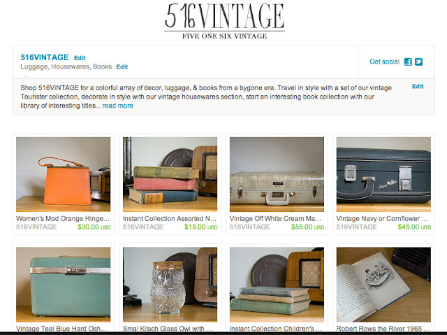
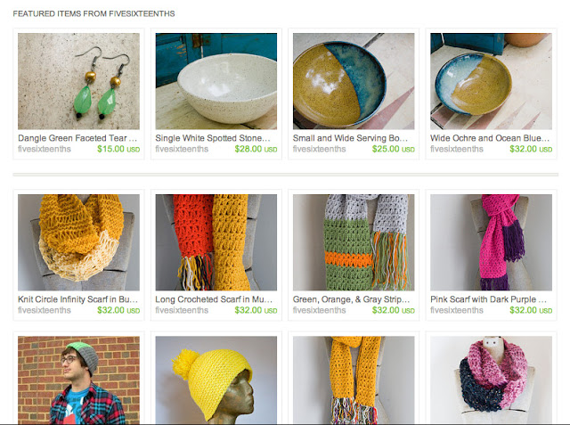
a look. For the vintage shop, I think we've got a look down & it was pretty simple: 516VINTAGE is about curating collections through story telling so, when taking pictures, I tried to tell a story. Staging the photos was so fun & making little vignettes that put the items in a place made sense. For the blog, I've got a pretty branded look - it's well designed yet playful & I really like how it looks over all and how it compliments my content. But for Five Sixteenths shop......I struggle with coming up with a cohesive shop look.
 |
| Sneak Peek at the look of 516VINTAGE |
 |
| Current look of Five Sixteenths |
This is where my trips to the mall come in: I am constantly looking for color & design inspiration and while I soak it up, I don't seem to squeeze much of it out. I am half writing this post because I love finding inspiration & half writing it so I'll remember and maybe do something about it. Here's some shop love inspiration from around the web:
I am in love with this fall display from Anthropologie. The earthy tones, deep pumpkins & purples makes me remember
why I love fall so much! I think (and this was pointed out to me in art school) that I have a hard time because I try not to do what I'm inclined to do - I think it's stupid so I don't do it! I think taking the shop's overall feel back to an earthy look would be wonderful. Those big handmade flowers look lovely too. Anthropologie & Free People inspire the heck outta me! In fact, here's another one:
The sense of home & collection in Anthropologie is amazing! Love it!
I also want to seamlessly blend the blog design elements in the shop with the real, tangible things. For this I look to the Red Velvet shop for some help. I don't know how they do it but blending web & real life so effortlessly is something I admire!
I've actually been taking the Dream Job E-Course offered through Red Velvet & have a better apreciation for the way their online shop looks now. It's clean & simple and can grow with them. This is something I really, really want to
finally settle on! I've actually tried to gear my logos/headers/etc towards this look of simple. Again inspired by the Red Velvet shop + Anthropologie's shop. Sophisticated boho chic...i guess.
I am also digging the online sites like LibbyStory with painted elements & arty brush strokes. Keeping with the arty-ness of the blog, that is what I want to translate into the Five Sixteenths shop:
Another shop I dig online & in stores is Francesca's. Again with the boho chic-ness. Just an overall house, home, clothing, accessories, etc store where everything comes together in a seamless fashion. I know that photos are half of it but I just can't get that consistency!
With going through the Dream Job E-Course & following the A Beautiful Mess blog every day I've gotten excited about a lot of things. I really can't wait for Elsie to share more about her
color story process because that just looks so fun & a great way to start thinking about colors. I really need to focus on the style of the shop & hope that I can figure something out here soon. I just have to remember to go my way & not lead into something else!!
Have any tips for branding or keeping things cohesive? let me know!


I have gotten the Dream Job E-Course, the Blog Love E-Course and the Sew me Pretty E-Course (they were having a sale - I splurged!!)
ReplyDeleteIt's awesome info though isn't it? Like you, I sell a variety of things in my store and it's hard to get any consistency going therefore.
Keep us posted if you have any brainwaves!
Sarah
http://acatlikecuriosity.blogspot.co.uk/
I took that e-course too and enjoyed it a lot. There are some snippets I took away from it, the rest I'm kind of molding on my own. :)
ReplyDeleteI have some suggestions/ideas for your Etsy shop. With your jewelry listings, is there a way you can incorporate your pottery in to it? Like have your earrings hanging off a bowl? It might help make things look cohesive.
I didn't go through all of your Knitwear listings but the ones I did see all have the same photo - using the mannequin which is fine but again, you should try to do one "Artsy" photo with your scarf casually laying on a table with one of your pots in the background - think Anthropologie catalog! :) You can tell a story with those items too.
ugh! this is a sore spot for me recently for something totally unrelated to blogging. i love great site and branding and my company is....i'm not going to get into it but basically i remember finding great inspiration and it being great for awhile then the world basically ended (2000 of a product i designed are being pulled because of IP debate over the naming.....ugh)
ReplyDeleteokay! anyhow! these are all beautiful inspiration - and you just reminded me about how bad i want that cat dress at anthropologie
<3 katherine
of corgis and cocktails // current giveaway