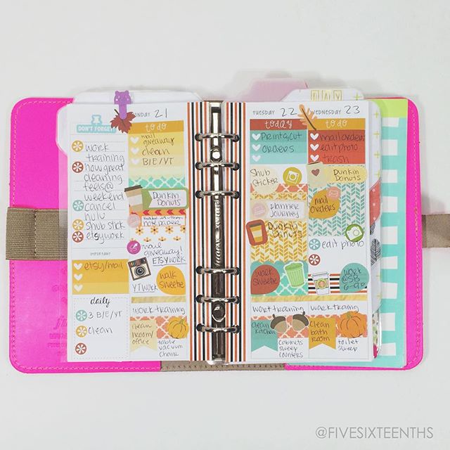
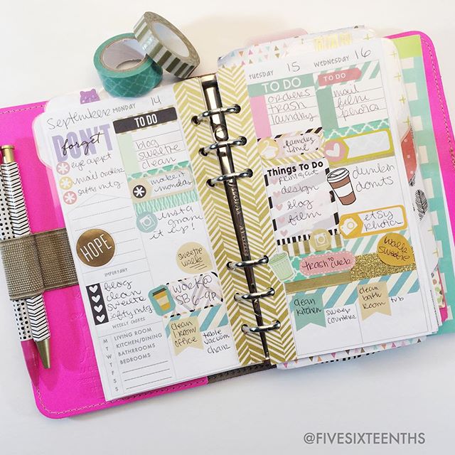
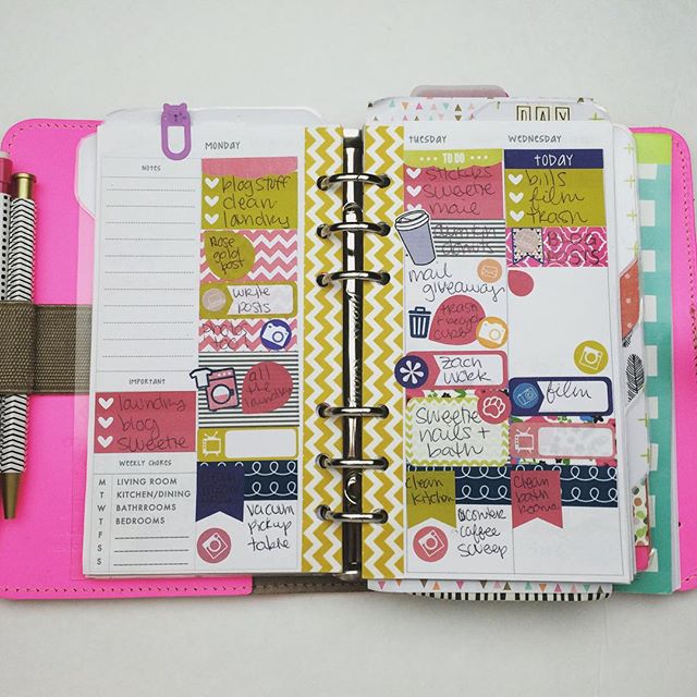
A bit ago I posted my Planner Journey and I talked about how over the past two years (ish) I've tried multiple planner systems and switched between planners. I've built up my ring bound planner collection and even have my eye on a few more. My planner peace currently is a single ring bound planner - my Filofax Original in Flouro Pink. I have a set up video from when I first moved into my Filofax but I've since changed it....and this is the post to talk about it!
First, if you haven't read my planner journey - click here.....I'll wait.
I've never purchased inserts before because I'm pretty creative with Word. I made my own from the beginning and experimented a lot with different styles. All of the styles consisted of a horizontal weekly spread. Week on one page, week on two page, week on one page with a graph page on the other side, all horizontal...all a weekly view. This became super overwhelming for me. I would see all I had to do for the week and just shut it out. I started getting into a weird planning funk and didn't do anything. It seemed like all I had to do was way too much. I've come to see now that it was the way the week flowed for me on a horizontal layout - I was seeing too much and I just couldn't get a flow down.
After purchasing a vertical Erin Condren Life Planner and using it for blog/youtube/etsy planning I fell in love with the vertical layout. Unfortunately I wasn't in love with the way uncoiling an EC and punching it for an A5 Filofax went......so I turned to other options. For a while there I was a 3 planner girl. I had my ECLP for the editorial calendar, my personal Filofax for weekly planning, and then a third, smaller planner for daily tasks. The ECLP was great because the 3 sections were perfect for blog/etsy/youtbue I needed to plan. The weekly planner showed me what I needed to do on the personal side of my life, plus if I needed to make sure I was free to film, or take photos, for the editorial calendar. The daily planner really helped me see only what needed to be done that day and I could just focus on what needed to be done a day at a time. Because of these three planners, I was able to feel less overwhelmed. But then I ended up with three planners.....and that was way too much. I needed a way to simplify and get all of what I was loving about 3 planners out of 1 planner.
I restructured my whole personal Filofax. I took out the sections I really, really didn't need (I don't even know what those sections were anymore!) and paired it down to monthly, weekly, and daily section, two blank sections, finances, and lists and to-do's. I am thinking of moving my blog/etsy/youtube ideas & schedule back into those two empty sections. I created a vertical layout in Word with Monday through Wednesday on a spread and Thursday through Sunday on another spread. And I have to say I love it.
I feel less overwhelmed because I am seeing the first half of the week and then the second half. I'm not looking too far into the future where I feel like I might lose my shit because there is too much too do. I also like the vertical layout beccause my eyes go down the page and not across. I feel like this was the problem with the horizontal layouts I tried - my eyes went down the page and then onto the next meaning I was seeing everything that was going on and couldn't focus on one day. Thinking only a few days ahead is helpfulf for me. Plus seeing the first half of the week as a unit and then the second half as a unit builds me up then winds me down.
I feel gung ho at the beginning of the week - I can see my master to do list, see Monday, Tuesday, and Wednesday. I'm not focused on getting to the weekend I'm focused on getting things done. The smaller size means I also can't fill it too full, especially for the master to-do list. I found the A5 and the ECLP to be helpful but way too big. I'd end up scheduling myself way to much and unable to complete it. Especially in addition to the two other planners I was working with. I didn't need all the room they all gave me, I just needed the separation they established.
I found that I didn't like the size of my day on one page layout - it was too big, as well - but I liked what I was doing with it. When using my day on one page inserts I'd often repeat things - I'd have a Top 3 section, a section marked out hourly, a Tonight section, an Important section, and then sections for Blog/Etsy/YouTube. So I would often write mail orders for Etsy under the top three, the important, and the Etsy section. While this seems redundant, it helped me know what was important to complete and for which section of my life I was completing the task. I use this in my vertical layout too. The top of my column always has a Top 3 to do list - the top things to be done that day or the top things I need to remember to do, etc. Then the rest of the column gets decorative, I may repeat things, but I always know to go straight to the Top 3.
At the bottom of my column is my cleaning routine for the day. I would say that I sort of see the bottom section as the night section, but that isn't always the case because I'll work on things from the middle section after I clean. In my day on a page I would list out the chore for the day and then the 3 things I needed to do a long with that chore. Keeping this in one section means my eyes go straight to that read the three things, and I don't feel overwhelmed.
This leaves the middle to be decorated. I've also gotten into pretty planning and love the no white space sticker planning. I like that it's kind of like a work of art by creating a fun, well balanced design across a page. I can use decorative and fuctional stickers that are designed for the ECLP in the spreads I've made because the columns are 1.5 inches wide. This may not be important to a lot of people but I found it hard to decorate the way I'd like in a horizontal layout. Stickers felt out of place for me and after using the vertical layout of both the MAMBI Happy Planner and the ECLP I really liked the idea of stickers and themes.
Once I get to the end of the week in my spread by flipping the Tuesday/Wednesday page, I'm winding down. There are only two more days until the weekend, I can anticipate the fun things that will be done on Friday and Thursdays I try to make my big etsy work days - listings, organization, etc. So I can see that the week is coming to a close. I treat Saturday and Sunday like one big day so often I have a to do list either on a sticky note or on a list pad that I've punched with the six holes. I can just check off as a I go. Once it gets to Sunday I make time to plan my week out like this again.
I rarely use the monthly view as I find the boxes are too small - I loved the monthly space in the A5 and the ECLP. I'm thinking about using a sort of fold out insert for monthly because it would be helpful to include my editorial calendar in my personal filofax. Right now I'm sort of flying by the seat of my pants! I also only use the day on one page - designed to fit ECLP style stickers as well - when I have a super busy day. I have a full section for it but I hardly use it. This system is still ever evloving so I might take that out all together!
I hope this little post was a little insight into my reasoning from switching planner inserts. I felt that it was something I really wanted to share with other planner girls. If you're interested there is a free half letter size (nearly A5 size) free download on the blog but you can find a downloadable proper A5 size and personal size in my shop. If you're more the printed insert type, Sew Much Crafting on Etsy will mail you dated personal and half letter size inserts, so check out her shop!
How did you discover your perfect way of planning? Are you still on your planner journey?
xoxo, Moe


That particular journey never ends. Life and needs/wants are always changing. This just might be the way to make a Personal or Pocket size work for me. I’m currently in a FC Compact with a vertical W2P, but every once in awhile I get the itch to downsize (into my super cute Raspberry Pocket Saffiano.) Very interesting.
ReplyDeleteI like to see my whole week, but your point about being gung ho M - W is a good one. I'm like that, too.
ReplyDelete