A little while ago a new app called Paint Paper Studio launched and I was dying to download it. It is a pretty simple app - allows you to put overlays onto photos or predesigned backgrounds included in the app. Well as soon as I found it I shared it on Instagram - where else do you go to find fun things - and a friend of mine, Criss, came up with the idea to make stickers from the images she created. Of course I thought that was a brilliant idea an asked her if I could share it here on the blog with you all. So today I want to share with you my take on making stickers from the Paint paper Studio app as well as other overlay apps you may be in love with
Supplies :: overlay apps and images created with them, Circle Crop app (or you can use PicMonkey for free on your computer), printer, sticker paper, die cutting machine (I'll be using my Cricut Explore but you can also print and cut by hand)
First you'll need to create some fun images using your favorite overlay apps. I love mixing and matching the apps I use and even using downloaded backgrounds from my favorite pattern making site ColourLovers.com. If you need some inspiration, click this post for a list of my favorite overlay apps.
In this post I'll be making circular stickers (but you can make square ones or ones that fit in ECLP or MAMBI Happy Planner boxes) so I need to take my images into another app that can create a circle frame around my sticker. I like to do everything on my phone - this project is great to work on when your waiting somewhere because you can just design on your phone while you wait and print them out later. I'll be pulling my images into a fun app I just found called Circle Crop.
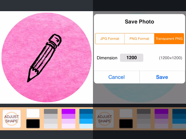
Circle Crop lets you crop images in to the shape of a circle, like the name says, but get this - you can set the image with transparent background and save it as a .PNG! Isn't that super cool?? This means that when the image is uploaded to Cricut Design Space it doesn't need any clean up. .PNG files are my favorite to use in Design Space. It is a shame that the new Cricut App for the iPad doesn't not support uploading from your image library to your matt. I do hope that feature is added!
Once all the images are croped into a circle, I send the images over to my computer to open in Design Space (obviously you can use the Sillouhette Software if you have it or drop your images into Word and cut by hand, but I do like the simplicity of using a die cutting machine!) I usually email my images to myself but you could also use Google Drive or Dropbox.
Uploading each image to Design Space is super simple and with no white area to clean up the images are ready to use. Just insert them in to the canvas area and resize. I resized to about .75 inches. That happens to be the perfect size for my planners - not too big but not too small.
Once you have them all added to the canvas you can either align them how you'd like and then flatten the entire image to have a predesigned sticker sheet or you can let the site fill your cutting matt with the images by selecting how many 'projects' you'd like to make.
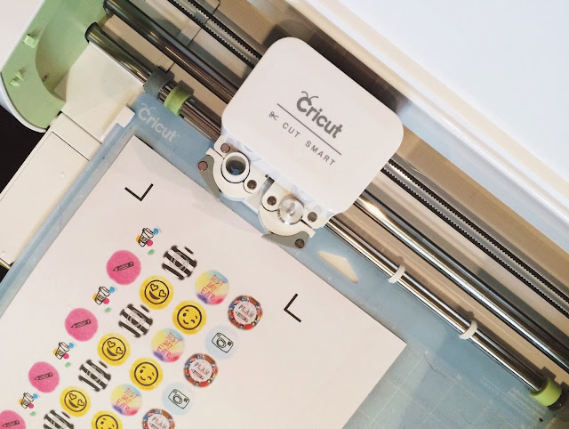
I always leave the bleed on when it comes to print then cut with my Cricut. I do not like how it looks when printed - to fuzzy and unprofesional looking - but when you peel the top layer of sticker paper away you're left with a pretty nice sticker sheet.
For this DIY I used Office Max full sheet shipping layers and the custom setting of Washi Tape from the custom menu. The Cricut Sticker paper is super thick so using that setting will cut straight through your sticker paper. I find this setting works great for all sorts of shipping label adhesive paper and the Avery Sticker sheets.
For this DIY I used Office Max full sheet shipping layers and the custom setting of Washi Tape from the custom menu. The Cricut Sticker paper is super thick so using that setting will cut straight through your sticker paper. I find this setting works great for all sorts of shipping label adhesive paper and the Avery Sticker sheets.
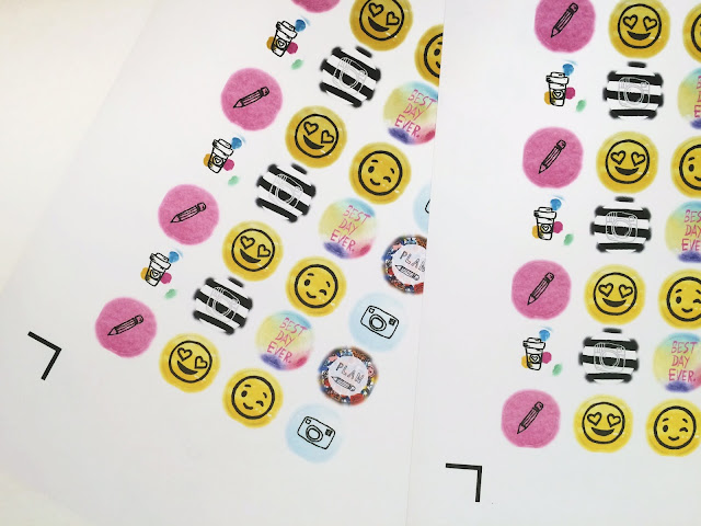
In this image you can see how fuzzy the outline is from the bleed. I think, personally, the bleed works the best when you design inside Cricut Design Space. It is probably because the images used within Design Space have been created with the bleed in mind. If you print without the bleed though, you risk having some white show on your final sticker.
I just pull the top layer of sticker paper away to get a nicer looking sticker sheet.
I just pull the top layer of sticker paper away to get a nicer looking sticker sheet.
I think any app that has hand drawn elements to it like the Paint Paper Studio app or the A Beautiful Mess app are perfect for this DIY.
How do you utilize your phone for creative design? Any apps I should check out?
xoxo, Moe


Thanks for this tutorial! I have been wanting to make my own stickers for a while now and I finally got a chance to use my print and cut feature to print out some free stickers I found online. I was actually second guessing my decision of purchasing my Cricut because it seems like a lot of sticker paper is waster when you use the print and cut feature, but I guess I can live with that since I know I can save by getting shipping labels! This tutorial was super helpful!
ReplyDelete