Wow, I haven't done a Make it Monday in like a zillion years (the last one was August 27th)!! In fact, I didn't know what to share with you today until I thought about how to implement some things that were discussed in the Blogging Basics eBook that I released last week. This ebook is broken into 3 chapters: Organization, Design, & Networking. Today, I want to share with you a little insight into the Design chapter.
In the book I talk about the difference between Serif & Sans Serif fonts & how to decide which ones suit your blog better. Serif Fonts say stability, classic, & sophisticated while Sans Serif Fonts usually say clean, modern, & playful. The font styles you pick depend on how you see your blog. I've done a total DIY blog design before in a more playful manner here on the blog and in the eBook you'll discover exactly what to think about while creating a design from start to finish.
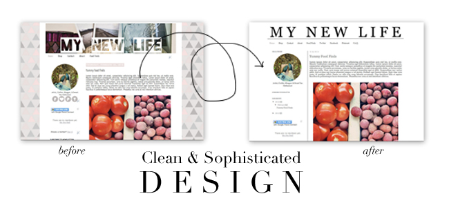
Today I want to share how to add just a little bit of class to the Simple Template in Black & White here on blogger. This template is the same I used in the DIY Blog Design & I think it's the easiest to customize with little to no HTML knowledge. The Template designer gives you a lot of control over each part of the design. We'll explore how to make a sophisticated, simple, & modern blog design that focuses on content.
- key points of this design -
Serif Fonts - the serif fonts create a classic, sophisticated look. It's clean & simple with out too much fluff. The font used throughout the entire design is Georgia. I like serif fonts because of the diversity between the italic, bold, & normal weights. I think it gives a more cohesive look
Header - instead of focusing on picture based header, create a text based header in a program where you can create a blank canvas. You could also overlay a white rectangle over a picture in Picmonkey. To add interest, put a space between each letter to spread out the letters & create a strong header.
Navigation Links - creating a strong navigation bar moves a lot of links from your sidebar into one place. Moving the social networks to the navigation at the top of the page makes the sidebars squeaky clean! Like your social network icons? Make them a little bit smaller so they don't distract from the content. Use this tutorial to learn how to make links in your navigation bar.
The clean design is created by breaking down the design into a basic framework to accent your content. This is also a great simple base to jump from. In the eBook, you'll see a complete list of things to consider when taking your blog design from blah to boyah. Pick up your copy here.
Today I'll be working on a lovely, simple design & hopefully get it wrapped up. I've been trying some new things & can't wait to share it with you! I totally hope the blogger loves it too :)
How does your blog design reflect you?


I love the cleaner look! xxx
ReplyDeleteOoh, so fun to read. I looooove thinking about fonts and what they say/represent!! This has me yearning for a new blog design... but it's all part of something bigger, right, larger branding effort!! Lots more to think about! I do think I should spend some time and make a new header and play with templates... love the clean and sophisticated vibe you've got going now! Inspiring! Checking out those links, too!
ReplyDeleteI've noticed more and more clean looking blogs and was wondering where to start to get that classy look, rather than my homemade hodgepodge! Thank you!
ReplyDeleteI love this look!
ReplyDelete